设置有主按钮的组件
场景介绍
从6.0.0(20) Beta1版本开始,新增支持设置有主按钮的组件。
HdsActionBar组件支持多个按钮的样式。当应用开发者需要多个按钮并且有主按钮,支持展开和收缩的动效时,可以通过设置主按钮配置样式。
开发步骤
-
导入相关模块。
import { HdsActionBar, ActionBarButton, ActionBarStyle } from '@kit.UIDesignKit'; -
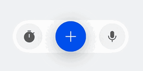
创建左边的按钮数组startButtons,创建右边的按钮数组endButtons,创建主按钮primaryButton,设置isExpand初始值是true表示HdsActionBar的初始状态是展开状态,点击主按钮会收起,再次点击可以展开。
@Entry@ComponentV2struct TestActionBar {@Local isExpand: boolean = true;@Local isPrimaryIconChanged: boolean = false;@Local primaryHoverTips: ResourceStr = '开始';build() {Column() {HdsActionBar({startButtons: [new ActionBarButton({baseIcon: $r('sys.symbol.stopwatch_fill')})],endButtons: [new ActionBarButton({baseIcon: $r('sys.symbol.mic_fill')})],primaryButton: new ActionBarButton({baseIcon: $r('sys.symbol.plus'),altIcon: $r('sys.symbol.play_fill'),onClick: () => {this.isExpand = !this.isExpand;this.isPrimaryIconChanged = !this.isPrimaryIconChanged;if (this.isPrimaryIconChanged) {this.primaryHoverTips = '暂停';} else {this.primaryHoverTips = '开始';}},hoverTips: this.primaryHoverTips}),actionBarStyle: new ActionBarStyle({isPrimaryIconChanged: this.isPrimaryIconChanged}),isExpand: this.isExpand!!})}.width('100%').height('100%').backgroundColor(0xF1F3F5).justifyContent(FlexAlign.Center).alignItems(HorizontalAlign.Center)}}