按钮与选择组件常见问题
本文档介绍按钮与选择组件的常见问题并提供参考。
Slider组件滑块与滑轨是如何对齐的
Slider的滑块与滑轨显示样式SliderStyle有三种,其中SliderStyle.OutSet与SliderStyle.InSet存在滑块。Slider的滑动条进度为最小值时,滑块对齐方式如下:
SliderStyle.OutSet模式下,滑块的中心与滑轨的端点对齐,示例图如下:

SliderStyle.InSet模式下,滑块与滑轨的中心对齐,即距离端点滑轨高度的一半的位置,示例图如下:

示例
@Entry
@Component
struct Index {
  build() {
    Column() {
      Slider({
        style: SliderStyle.OutSet
      })
        .blockSize({
          width: 20,
          height: 20
        })
        .trackThickness(50)
      Slider({
        style: SliderStyle.InSet
      })
        .blockSize({
          width: 20,
          height: 20
        })
        .trackThickness(50)
    }
    .height('100%')
    .width('100%')
  }
}
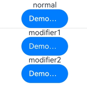
使用AttributeModifier设置Button的LabelStyle时,默认字体粗细与直接设置不一致
问题现象
在Button组件中设置LabelStyle时,采用不同设置方式会出现Label文本默认字体粗细显示不一致的现象。
可能原因
设置LabelStyle有两种方式,其中:
- 直接设置LabelStyle。此时font属性中的weight默认值为FontWeight.Medium,对应数值500。
- 通过AttributeModifier接口设置。此时font属性中的weight默认值为400,与LabelStyle对象说明中的默认值存在差异。
解决措施
为避免不同设置方式导致的显示差异,建议在通过AttributeModifier接口设置LabelStyle时,显式指定weight的值,以确保文本样式符合预期,具体示例如下。
// pages/ButtonModifierFAQ.ets
class MyButtonModifier1 implements AttributeModifier<ButtonAttribute> {
  applyNormalAttribute(instance: ButtonAttribute): void {
    instance.labelStyle({});
  }
}

class MyButtonModifier2 implements AttributeModifier<ButtonAttribute> {
  applyNormalAttribute(instance: ButtonAttribute): void {
    instance.labelStyle({
      font: {
        weight: FontWeight.Medium
      }
    });
  }
}

@Entry
@Component
struct Index {
  @State modifier1: MyButtonModifier1 = new MyButtonModifier1();
  @State modifier2: MyButtonModifier2 = new MyButtonModifier2();

  build() {
    Column() {
      Text('normal')
      // Button直接设置labelStyle,font属性中的weight默认值为500
      Button('DemoButtonTest')
        .width(100)
        .labelStyle({})
      Divider()
      // 通过AttributeModifier接口设置labelStyle,font属性中的weight默认值为400
      Text('modifier1')
      Button('DemoButtonTest')
        .width(100)
        .attributeModifier(this.modifier1)

      Text('modifier2')
      Button('DemoButtonTest')
        .width(100)
        .attributeModifier(this.modifier2)
    }.height('100%')
  }
}
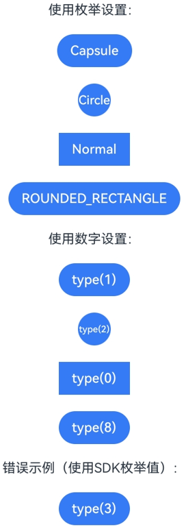
Button组件设置type时,ButtonType枚举值与数字值不一致
问题现象
Button组件的type属性支持使用ButtonType枚举或数字进行设置,但SDK中枚举的数值与实际type可用的数值不一致。例如ButtonType.ROUNDED_RECTANGLE枚举数值为3,但是使用type(ButtonType.ROUNDED_RECTANGLE)与type(3)的效果不同。
可能原因
ButtonType枚举数值的定义仅表示枚举项的索引,与type属性实际接收数值不同。映射如下:
| ButtonType枚举 | 枚举值 | type实际数值 |
|---|---|---|
| Normal | 2 | 0 |
| Capsule | 0 | 1 |
| Circle | 1 | 2 |
| ROUNDED_RECTANGLE | 3 | 8 |
因此,type(8)的效果等同于type(ButtonType.ROUNDED_RECTANGLE),而type(3)不对应任何有效类型,API version 18之前会使用默认值ButtonType.Capsule,API version 18及之后会使用默认值ButtonType.ROUNDED_RECTANGLE。
解决措施
建议使用ButtonType枚举进行设置,避免直接使用数字值可能带来的混淆。如果确需使用数字值,请参照上表中的"type实际数值"列进行设置。
示例
// pages/ButtonTypeFAQ.ets
@Entry
@Component
struct ButtonTypeDemo {
  build() {
    Column({ space: 20 }) {
      // 使用枚举设置(推荐)
      Text('使用枚举设置:')
      Button('Capsule')
        .type(ButtonType.Capsule)
      Button('Circle')
        .type(ButtonType.Circle)
      Button('Normal')
        .type(ButtonType.Normal)
      Button('ROUNDED_RECTANGLE')
        .type(ButtonType.ROUNDED_RECTANGLE)

      // 使用数字设置(需使用type实际数值)
      Text('使用数字设置:')
      Button('type(1)')
        .type(1) // 等同于 ButtonType.Capsule
      Button('type(2)')
        .type(2) // 等同于 ButtonType.Circle
      Button('type(0)')
        .type(0) // 等同于 ButtonType.Normal
      Button('type(8)')
        .type(8) // 等同于 ButtonType.ROUNDED_RECTANGLE

      // 错误示例:使用SDK枚举值作为type数字
      Text('错误示例(使用SDK枚举值):')
      Button('type(3)')
        .type(3) // 不对应任何类型,使用默认样式
    }
    .width('100%')
    .height('100%')
    .backgroundColor(Color.White)
    .justifyContent(FlexAlign.Center)
  }
}