属性修改器 (AttributeModifier)
概述
声明式语法引入了@Styles和@Extend两个装饰器,可以解决复用相同自定义样式的问题,但是存在以下受限场景:
- @Styles和@Extend均是编译期处理,不支持跨文件的导出复用。
- @Styles仅能支持通用属性、事件,不支持组件特有的属性。
- @Styles虽然支持在多态样式下使用,但不支持传参,无法对外开放一些属性。
- @Extend虽然能支持特定组件的私有属性、事件,但同样不支持跨文件导出复用。
- @Styles、@Extend对于属性设置,无法支持业务逻辑编写,动态决定是否设置某些属性,只能通过三元表达式对所有可能设置的属性进行全量设置,设置大量属性时效率较低。
为了解决上述问题,ArkUI引入了AttributeModifier机制,可以通过Modifier对象动态修改属性。能力对比如下:
| 能力 | @Styles | @Extend | AttributeModifier |
|---|---|---|---|
| 跨文件导出 | 不支持 | 不支持 | 支持 |
| 通用属性设置 | 支持 | 支持 | 支持 |
| 通用事件设置 | 支持 | 支持 | 部分支持 |
| 组件特有属性设置 | 不支持 | 支持 | 部分支持 |
| 组件特有事件设置 | 不支持 | 支持 | 部分支持 |
| 参数传递 | 不支持 | 支持 | 支持 |
| 多态样式 | 支持 | 不支持 | 支持 |
| 业务逻辑 | 不支持 | 不支持 | 支持 |
可以看出,与@Styles和@Extend相比,AttributeModifier提供了更强的能力和灵活性,且在持续完善全量的属性和事件设置能力,因此推荐优先使用AttributeModifier。
接口定义
declare interface AttributeModifier<T> {

  applyNormalAttribute?(instance: T): void;

  applyPressedAttribute?(instance: T): void;

  applyFocusedAttribute?(instance: T): void;

  applyDisabledAttribute?(instance: T): void;

  applySelectedAttribute?(instance: T): void;

}
AttributeModifier是一个接口,开发者需要实现其中的applyXxxAttribute方法来实现对应场景的属性设置。Xxx表示多态的场景,支持默认态(Normal)、按压态(Pressed)、焦点态(Focused)、禁用态(Disabled)、选择态(Selected)。T是组件的属性类型,开发者可以在回调中获取到属性对象,通过该对象设置属性。
declare class CommonMethod<T> {
  attributeModifier(modifier: AttributeModifier<T>): T;
}
组件的通用方法增加了attributeModifier方法,支持传入自定义的Modifier。由于组件在实例化时会明确T的类型,所以调用该方法时,T必须指定为组件对应的Attribute类型,或者是CommonAttribute。
使用说明
- 组件通用方法attributeModifier支持传入一个实现AttributeModifier<T>接口的实例,T必须指定为组件对应的Attribute类型,或者是CommonAttribute。
- 在组件首次初始化或者关联的状态变量发生变化时,如果传入的实例实现了对应接口,会触发applyNormalAttribute。
- 回调applyNormalAttribute时,会传入组件属性对象,通过该对象可以设置当前组件的属性/事件。
- 暂未支持的属性/事件,执行时会抛异常。
- 属性变化触发applyXxxAttribute函数时,该组件之前已设置的属性,在本次变化后未设置的属性会恢复为属性的默认值。
- 可以通过该接口使用多态样式的功能,例如如果需要在组件进入按压态时设置某些属性,就可以通过自定义实现applyPressedAttribute方法完成。
- 一个组件上同时使用属性方法和applyNormalAttribute设置相同的属性,遵循属性覆盖原则,即后设置的属性生效。
- 一个Modifier实例对象可以在多个组件上使用。
- 一个组件上多次使用applyNormalAttribute设置不同的Modifier实例,每次状态变量刷新均会按顺序执行这些实例的方法属性设置,同样遵循属性覆盖原则。
设置和修改组件属性
AttributeModifier可以分离UI与样式,支持参数传递及业务逻辑编写,并且通过状态变量触发刷新。
export class MyButtonModifier implements AttributeModifier<ButtonAttribute> {
  // 可以实现一个Modifier,定义私有的成员变量,外部可动态修改
  public isDark: boolean = false

  // 通过构造函数,创建时传参
  constructor(dark?: boolean) {
    this.isDark = dark ?? false
  }

  applyNormalAttribute(instance: ButtonAttribute): void {
    // instance为Button的属性对象,可以通过instance对象对属性进行修改
    if (this.isDark) { // 支持业务逻辑的编写
      // 属性变化触发apply函数时,变化前已设置并且变化后未设置的属性会恢复为默认值
      instance.backgroundColor('#707070')
    } else {
      // 支持属性的链式调用
      instance.backgroundColor('#17A98D')
        .borderColor('#707070')
        .borderWidth(2)
    }
  }
}
// pages/Button1.ets
import { MyButtonModifier } from '../Common/ButtonModifier01'

@Entry
@Component
struct Button1 {
  // 支持用状态装饰器修饰,行为和普通的对象一致
  @State modifier: MyButtonModifier = new MyButtonModifier(true);

  build() {
    Row() {
      Column() {
        Button('Button')
          .attributeModifier(this.modifier)
          .onClick(() => {
            // 对象的一层属性被修改时,会触发UI刷新,重新执行applyNormalAttribute
            this.modifier.isDark = !this.modifier.isDark
          })
      }
      .width('100%')
    }
    .height('100%')
  }
}
当一个组件上同时使用属性方法和applyNormalAttribute设置相同的属性时,遵循属性覆盖原则,即后设置的属性生效。
export class MyButtonModifier implements AttributeModifier<ButtonAttribute> {
  // 可以实现一个Modifier,定义私有的成员变量,外部可动态修改
  public isDark: boolean = false

  // 通过构造函数,创建时传参
  constructor(dark?: boolean) {
    this.isDark = dark ?? false
  }

  applyNormalAttribute(instance: ButtonAttribute): void {
    // instance为Button的属性对象,可以通过instance对象对属性进行修改
    if (this.isDark) { // 支持业务逻辑的编写
      // 属性变化触发apply函数时,变化前已设置并且变化后未设置的属性会恢复为默认值
      instance.backgroundColor('#707070')
    } else {
      // 支持属性的链式调用
      instance.backgroundColor('#17A98D')
        .borderColor('#707070')
        .borderWidth(2)
    }
  }
}
// pages/Button2.ets
import { MyButtonModifier } from '../Common/ButtonModifier01'
@Entry
@Component
struct Button2 {
@State modifier: MyButtonModifier = new MyButtonModifier(true);
build() {
Row() {
Column() {
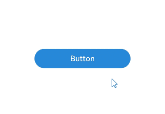
// 先设置属性,后设置modifier,按钮颜色会跟随modifier的值改变
Button('Button')
.backgroundColor('#2787D9')
.attributeModifier(this.modifier)
.onClick(() => {
this.modifier.isDark = !this.modifier.isDark
})
}
.width('100%')
}
.height('100%')
}
}
当一个组件上多次使用applyNormalAttribute设置不同的Modifier实例时,每次状态变量刷新均会按顺序执行这些实例的方法属性设置,遵循属性覆盖原则,即后设置的属性生效。
export class MyButtonModifier2 implements AttributeModifier<ButtonAttribute> {
  public isDark: boolean = false

  constructor(dark?: boolean) {
    this.isDark = dark ?? false
  }

  applyNormalAttribute(instance: ButtonAttribute): void {
    if (this.isDark) {
      instance.backgroundColor(Color.Black)
        .width(200)
    } else {
      instance.backgroundColor(Color.Red)
        .width(100)
    }
  }
}
export class MyButtonModifier3 implements AttributeModifier<ButtonAttribute> {
  public isDark2: boolean = false

  constructor(dark?: boolean) {
    this.isDark2 = dark ? dark : false
  }

  applyNormalAttribute(instance: ButtonAttribute): void {
    if (this.isDark2) {
      instance.backgroundColor('#2787D9')
    } else {
      instance.backgroundColor('#707070')
    }
  }
}
// pages/Button3.ets
import { MyButtonModifier2 } from '../Common/ButtonModifier02';
import { MyButtonModifier3 } from '../Common/ButtonModifier03';

@Entry
@Component
struct Button3 {
  @State modifier: MyButtonModifier2 = new MyButtonModifier2(true);
  @State modifier2: MyButtonModifier3 = new MyButtonModifier3(true);

  build() {
    Row() {
      Column() {
        Button('Button')
          .attributeModifier(this.modifier)
          .attributeModifier(this.modifier2)
          .onClick(() => {
            this.modifier.isDark = !this.modifier.isDark
            this.modifier2.isDark2 = !this.modifier2.isDark2
          })
      }
      .width('100%')
    }
    .height('100%')
  }
}
设置多态样式、事件
使用AttributeModifier设置多态样式、事件,实现事件逻辑的复用,支持默认态(Normal)、按压态(Pressed)、焦点态(Focused)、禁用态(Disabled)、选择态(Selected)。例如如果需要在组件进入按压态时设置某些属性,就可以通过自定义实现applyPressedAttribute方法完成。
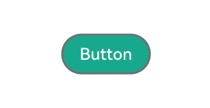
export class MyButtonModifier4 implements AttributeModifier<ButtonAttribute> {
  applyNormalAttribute(instance: ButtonAttribute): void {
    // instance为Button的属性对象,设置正常状态下属性值
    instance.backgroundColor('#17A98D')
      .borderColor('#707070')
      .borderWidth(2)
  }

  applyPressedAttribute(instance: ButtonAttribute): void {
    // instance为Button的属性对象,设置按压状态下属性值
    instance.backgroundColor('#2787D9')
      .borderColor('#FFC000')
      .borderWidth(5)
  }
}
// pages/Button4.ets
import { MyButtonModifier4 } from '../Common/ButtonModifier04'

@Entry
@Component
struct Button4 {
  @State modifier: MyButtonModifier4 = new MyButtonModifier4();

  build() {
    Row() {
      Column() {
        Button('Button')
          .attributeModifier(this.modifier)
      }
      .width('100%')
    }
    .height('100%')
  }
}
属性或事件对attributeModifier的支持情况
通过attributeModifier动态设置属性或事件的能力从API version 11开始支持。
属性或事件不支持attributeModifier的范围
下表说明了当前不支持attributeModifier的属性或事件。若无特殊说明,属性或事件默认在首次开放时支持attributeModifier。
| 组件通用信息/系统组件的名称 | 属性/事件的名称 | 告警信息 | 说明 |
|---|---|---|---|
| CommonAttribute | accessibilityText | - | - |
| CommonAttribute | accessibilityDescription | - | - |
| CommonAttribute | animation | Method not implemented. | 不支持animation相关属性。 |
| CommonAttribute | attributeModifier | - | attributeModifier不支持嵌套使用,不生效。 |
| CommonAttribute | backgroundFilter | is not callable | - |
| CommonAttribute | chainWeight | is not callable | - |
| CommonAttribute | compositingFilter | is not callable | - |
| CommonAttribute | drawModifier | is not callable | 不支持modifier相关的属性。 |
| CommonAttribute | foregroundFilter | is not callable | - |
| CommonAttribute | freeze | is not callable | - |
| CommonAttribute | gesture | Method not implemented. | 不支持gesture相关的属性。 |
| CommonAttribute | gestureModifier | is not callable | 不支持modifier相关的属性。 |
| CommonAttribute | onAccessibilityHover | is not callable | - |
| CommonAttribute | onDigitalCrown | is not callable. | - |
| CommonAttribute | parallelGesture | Method not implemented. | 不支持gesture相关的属性。 |
| CommonAttribute | priorityGesture | Method not implemented. | 不支持gesture相关的属性。 |
| CommonAttribute | reuseId | Method not implemented. | - |
| CommonAttribute | stateStyles | Method not implemented. | 不支持stateStyles相关的属性。 |
| CommonAttribute | useSizeType | Method not implemented. | 不支持已废弃属性。 |
| CommonAttribute | visualEffect | is not callable | - |
| CommonAttribute | bindContextMenu | Method not implemented. | 不支持入参为CustomBuilder。 |
| CommonAttribute | bindContentCover | Method not implemented. | 不支持入参为CustomBuilder。 |
| CommonAttribute | bindSheet | Method not implemented. | 不支持入参为CustomBuilder。 |
| CommonAttribute | dragPreview | Builder is not supported. | 不支持入参为CustomBuilder。 |
| CommonAttribute | bindPopup | Method not implemented. | 不支持入参为CustomBuilder。 |
| CommonAttribute | accessibilityVirtualNode | is not callable | 不支持入参为CustomBuilder。 |
| CommonAttribute | chainWeight | - | - |
| CheckboxGroup | contentModifier | - | - |
| CommonAttribute | backgroundImage | - | - |
| CommonAttribute | onClick | - | - |
| CommonAttribute | toolbar | - | - |
| CommonAttribute | accessibilityGroup | - | - |
| CommonAttribute | reuse | - | - |
| CommonAttribute | onGestureRecognizerJudgeBegin | - | - |
| EmbeddedComponent | onError | - | - |
| EmbeddedComponent | onTerminated | - | - |
| NavDestination | backButtonIcon19+ | - | - |
| NavDestination | menus19+ | - | - |
| NavDestination | customTransition | - | - |
| Navigation | backButtonIcon | - | - |
| Navigation | menus | - | - |
| Repeat | each | - | - |
| Repeat | key | - | - |
| Repeat | virtualScroll | - | - |
| Repeat | template | - | - |
| Repeat | templateId | - | - |
| Search | customKeyboard | - | - |
| Search | onWillAttachIME | - | - |
| Select | menuItemContentModifier12+ | - | - |
| Select | menuItemContentModifier18+ | - | - |
| Select | textModifier | - | - |
| Select | arrowModifier | - | - |
| Select | optionTextModifier | - | - |
| Select | selectedOptionTextModifier | - | - |
| Slider | digitalCrownSensitivity | - | - |
| Swiper | prevMargin | - | - |
| Swiper | nextMargin | - | - |
| TextArea | customKeyboard | - | - |
| Text | bindSelectionMenu | - | - |
| TextInput | customKeyboard | - | - |
| TextInput | onWillAttachIME | - | - |
| TextPicker | onEnterSelectedArea | - | - |
| TimePicker | onEnterSelectedArea | - | - |
属性或事件的起始版本与支持attributeModifier版本不一致的范围
下表说明了属性或事件的起始版本与默认支持attributeModifier版本不一致的情况。若无特殊说明,属性或事件默认在首次开放时支持attributeModifier。
| 组件通用信息/系统组件的名称 | 属性/事件的名称 | 属性/事件的起始版本 | 支持attributeModifier的版本 |
|---|---|---|---|
| AlphabetIndexer | autoCollapse | 11 | 12 |
| Button | buttonStyle | 11 | 12 |
| Button | controlSize | 11 | 12 |
| CalendarPicker | onChange | 18 | 20 |
| Canvas | enableAnalyzer | 12 | 20 |
| CommonAttribute | accessibilityTextHint | 12 | 20 |
| CommonAttribute | accessibilityChecked | 13 | 20 |
| CommonAttribute | accessibilitySelected | 13 | 20 |
| CommonAttribute | background | 10 | 20 |
| CommonAttribute | visualEffect | 12 | 20 |
| CommonAttribute | onDragStart | 8 | 13 |
| CommonAttribute | onVisibleAreaApproximateChange | 17 | 23 |
| CommonAttribute | onVisibleAreaChange | 9 | 20 |
| CommonAttribute | onTouchIntercept | 12 | 20 |
| CommonAttribute | onPreDrag | 12 | 20 |
| CommonAttribute | onChildTouchTest | 11 | 20 |
| CommonAttribute | backgroundFilter | 12 | 20 |
| CommonAttribute | foregroundFilter | 12 | 20 |
| CommonAttribute | compositingFilter | 12 | 20 |
| CommonAttribute | foregroundBlurStyle | 10 | 18 |
| CommonAttribute | freeze12+ | 12 | 20 |
| CommonAttribute | freeze18+ | 18 | 20 |
| CommonAttribute | dragPreviewOptions | 11 | 12 |
| CommonAttribute | bindMenu | 11 | 20 |
| CommonAttribute | transition | 12 | 20 |
| CommonAttribute | safeAreaPadding | 14 | 18 |
| CommonAttribute | pixelRound | 11 | 12 |
| ContainerSpan | textBackgroundStyle | 11 | 12 |
| DatePicker | onDateChange | 18 | 20 |
| FolderStack | alignContent | 11 | 12 |
| FolderStack | onFolderStateChange | 11 | 20 |
| FolderStack | onHoverStatusChange | 11 | 20 |
| FolderStack | enableAnimation | 11 | 12 |
| FolderStack | autoHalfFold | 11 | 12 |
| Gauge | privacySensitive | 12 | 20 |
| Image | enableAnalyzer | 11 | 12 |
| Image | resizable | 11 | 20 |
| List | OnScrollVisibleContentChangeCallback | 12 | 14 |
| List | onItemDragStart | 8 | 14 |
| NavDestination | title | 9 | 12 |
| NavDestination | mode | 11 | 12 |
| NavDestination | backButtonIcon11+ | 11 | 12 |
| NavDestination | menus12+ | 12 | 14 |
| NavDestination | toolbarConfiguration | 13 | 20 |
| NavDestination | onReady | 11 | 20 |
| NavDestination | onWillAppear | 12 | 20 |
| NavDestination | onWillDisappear | 12 | 20 |
| NavDestination | onWillShow | 12 | 20 |
| NavDestination | onWillHide | 12 | 20 |
| NavDestination | systemBarStyle | 12 | 20 |
| NavDestination | onResult | 15 | 22 |
| NavDestination | bindToScrollable | 14 | 22 |
| NavDestination | bindToNestedScrollable | 14 | 22 |
| NavDestination | onActive | 17 | 22 |
| NavDestination | onInactive | 17 | 22 |
| NavDestination | onNewParam | 19 | 22 |
| Navigation | title | 8 | 12 |
| Navigation | toolbarConfiguration | 10 | 20 |
| Navigation | customNavContentTransition | 11 | 20 |
| Navigation | systemBarStyle | 12 | 20 |
| Navigation | enableVisibilityLifecycleWithContentCover | 21 | 23 |
| PatternLock | backgroundColor | 9 | 20 |
| PatternLock | onDotConnect | 11 | 20 |
| Progress | privacySensitive | 12 | 20 |
| Refresh | onOffsetChange | 12 | 20 |
| RichEditor | customKeyboard | 10 | 23 |
| RichEditor | onDidIMEInput | 12 | 20 |
| RichEditor | enablePreviewText | 12 | 18 |
| RichEditor | placeholder | 12 | 18 |
| RichEditor | onWillChange | 12 | 18 |
| RichEditor | onDidChange | 12 | 18 |
| RichEditor | editMenuOptions | 12 | 18 |
| RichEditor | enableKeyboardOnFocus | 12 | 18 |
| RichEditor | enableHapticFeedback | 13 | 20 |
| RichEditor | barState | 13 | 18 |
| Select | menuBackgroundColor | 11 | 12 |
| Select | menuBackgroundBlurStyle | 11 | 12 |
| Swiper | displayCount | 8 | 12 |
| SymbolGlyph | fontSize | 11 | 12 |
| SymbolGlyph | fontColor | 11 | 12 |
| SymbolGlyph | fontWeight | 11 | 12 |
| SymbolGlyph | effectStrategy | 11 | 12 |
| SymbolGlyph | renderingStrategy | 11 | 12 |
| SymbolSpan | fontSize | 11 | 12 |
| SymbolSpan | fontColor | 11 | 12 |
| SymbolSpan | fontWeight | 11 | 12 |
| SymbolSpan | effectStrategy | 11 | 12 |
| SymbolSpan | renderingStrategy | 11 | 12 |
| ScrollableCommonAttribute | onWillScroll | 12 | 14 |
| ScrollableCommonAttribute | onDidScroll | 12 | 14 |
| TabContent | onWillShow | 12 | 20 |
| TabContent | onWillHide | 12 | 20 |
| Tabs | edgeEffect | 12 | 17 |
| Tabs | customContentTransition | 11 | 20 |
| Tabs | onContentWillChange | 12 | 20 |
| Tabs | barBackgroundBlurStyle | 11 | 12 |
| TextArea | enterKeyType | 11 | 12 |
| Text | enableHapticFeedback | 13 | 18 |
| TextInput | showCounter | 11 | 12 |
| TextInput | onSecurityStateChange | 12 | 20 |
| TextPicker | onScrollStop14+ | 14 | 20 |
| TextPicker | onScrollStop18+ | 18 | 20 |
| TextTimer | textShadow | 11 | 12 |
| TimePicker | enableHapticFeedback | 12 | 18 |
| TimePicker | onChange | 18 | 20 |
| Video | enableAnalyzer | 12 | 20 |
| Video | analyzerConfig | 12 | 20 |
| Video | onError | 7 | 20 |
| WaterFlow | onScrollIndex | 11 | 20 |