内容修改器 (ContentModifier)
当开发者期望自定义组件的内容区时,比如Checkbox的内部显示一个五角星等场景时,可以使用此功能。
仅Button、Checkbox、DataPanel、TextTimer、Slider、Select、Rating、Radio、Gauge、Toggle、TextClock组件支持该能力。
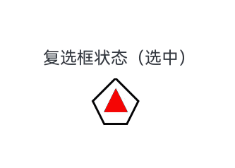
使用ContentModifier自定义Checkbox样式,用五边形Checkbox替换默认Checkbox。选中时,五边形内部显示红色三角图案,标题显示“选中”;取消选中时,红色三角图案消失,标题显示“非选中”。
import { hilog } from '@kit.PerformanceAnalysisKit';
import { resourceManager } from '@kit.LocalizationKit';

const DOMAIN = 0x0000;
// xxx.ets
class MyCheckboxStyle implements ContentModifier<CheckBoxConfiguration> {
  public selectedColor: Color = Color.White;

  constructor(selectedColor: Color) {
    this.selectedColor = selectedColor;
  }

  applyContent(): WrappedBuilder<[CheckBoxConfiguration]> {
    return wrapBuilder(buildCheckbox);
  }
}

@Builder
function buildCheckbox(config: CheckBoxConfiguration) {
  Column({ space: 10 }) {
    Text() {
      Span(config.name)
      // 请将$r('app.string.checked_context')替换为实际资源文件,在本示例中该资源文件的value值为"(选中)"
      // 请将$r('app.string.unchecked_context')替换为实际资源文件,在本示例中该资源文件的value值为"(非选中)"
      Span(config.selected ? $r('app.string.checked_context') : $r('app.string.unchecked_context'))
    }
    Shape() {
      // 五边形复选框样式
      Path()
        .width(200)
        .height(60)
        .commands('M100 0 L0 100 L50 200 L150 200 L200 100 Z')
        .fillOpacity(0)
        .strokeWidth(3)
      // 红色三角图案样式
      Path()
        .width(10)
        .height(10)
        .commands('M50 0 L100 100 L0 100 Z')
        .visibility(config.selected ? Visibility.Visible : Visibility.Hidden)
        .fill(config.selected ? (config.contentModifier as MyCheckboxStyle).selectedColor : Color.Black)
        .stroke((config.contentModifier as MyCheckboxStyle).selectedColor)
        .margin({ left: 11, top: 10 })
    }
    .width(300)
    .height(200)
    .viewPort({
      x: 0,
      y: 0,
      width: 310,
      height: 310
    })
    .strokeLineJoin(LineJoinStyle.Miter)
    .strokeMiterLimit(5)
    .onClick(() => {
      // 点击后,触发复选框点击状态变化
      if (config.selected) {
        config.triggerChange(false);
      } else {
        config.triggerChange(true);
      }
    })
    .margin({ left: 150 })
  }
}

@Entry
@Component
struct Index {
  private resmg: resourceManager.ResourceManager | undefined = this.getUIContext().getHostContext()?.resourceManager
  build() {
    Row() {
      Column() {
        //选中和不选中按钮
        // 请将$r('app.string.checkbox_status')替换为实际资源文件,在本示例中该资源文件的value值为"复选框状态"
        Checkbox({ name: this.resmg?.getStringSync($r('app.string.checkbox_status').id), group: 'checkboxGroup' })
          .select(true)
          .contentModifier(new MyCheckboxStyle(Color.Red))
          .onChange((value: boolean) => {
            hilog.info(DOMAIN, 'testTag', 'Checkbox change is' + value);
          })
      }
      .width('100%')
    }
    .height('100%')
  }
}