文本显示 (Text/Span)
Text是文本组件,用于展示用户视图,如显示文章的文字内容。该组件支持绑定自定义文本选择菜单,用户可根据需要选择不同功能。此外,还可以扩展自定义菜单,丰富可用选项,进一步提升用户体验。Span则用于展示行内文本。
常见问题请参考文本显示(Text/Span)常见问题。
创建文本
Text可通过以下两种方式来创建:
-
string字符串。
Text('我是一段文本')

-
引用Resource资源。
资源引用类型可以通过$r创建Resource类型对象,文件位置为/resources/base/element/string.json,具体内容如下:
{"string": [{"name": "module_desc","value": "模块描述"}]}// 请将$r('app.string.module_desc')替换为实际资源文件,在本示例中该资源文件的value值为"模块描述"Text($r('app.string.module_desc')).baselineOffset(0).fontSize(30).border({ width: 1 }).padding(10).width(300)
添加子组件
Span只能作为Text和RichEditor组件的子组件显示文本内容。可以在一个Text内添加多个Span来显示一段信息,例如产品说明书、承诺书等。
-
创建Span。
Span组件需嵌入在Text组件中才能显示,单独使用时不会显示任何内容。Text与Span同时配置文本内容时,Span内容将覆盖Text内容。
// 请将$r('app.string.TextSpan_textContent_text')替换为实际资源文件,在本示例中该资源文件的value值为"我是Text"Text($r('app.string.TextSpan_textContent_text')) {// 请将$r('app.string.TextSpan_textContent_span')替换为实际资源文件,在本示例中该资源文件的value值为"我是Span"Span($r('app.string.TextSpan_textContent_span'))}.padding(10).borderWidth(1)
-
设置文本装饰线及颜色。
通过decoration设置文本装饰线及颜色。
Text() {// 请将$r('app.string.TextSpan_textContent_span_one')替换为实际资源文件,在本示例中该资源文件的value值为"我是Span1,"Span($r('app.string.TextSpan_textContent_span_one')).fontSize(16).fontColor(Color.Grey).decoration({ type: TextDecorationType.LineThrough, color: Color.Red })// 请将$r('app.string.TextSpan_textContent_span_two')替换为实际资源文件,在本示例中该资源文件的value值为"我是Span2"Span($r('app.string.TextSpan_textContent_span_two')).fontColor(Color.Blue).fontSize(16).fontStyle(FontStyle.Italic).decoration({ type: TextDecorationType.Underline, color: Color.Black })// 请将$r('app.string.TextSpan_textContent_span_three')替换为实际资源文件,在本示例中该资源文件的value值为",我是Span3"Span($r('app.string.TextSpan_textContent_span_three')).fontSize(16).fontColor(Color.Grey).decoration({ type: TextDecorationType.Overline, color: Color.Green })}.borderWidth(1).padding(10)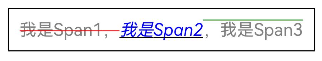
-
通过textCase设置文字一直保持大写或者小写状态。
Text() {Span('I am Upper-span').fontSize(12).textCase(TextCase.UpperCase)}.borderWidth(1).padding(10)
-
添加事件。
由于Span组件无尺寸信息,仅支持添加点击事件onClick、悬浮事件onHover。
// xxx.etsimport { hilog } from '@kit.PerformanceAnalysisKit';@Entry@Componentexport struct TextSpanOnHover {@State textStr1: string = '';@State textStr2: string = '';build() {NavDestination() {Row() {Column() {Text() {Span('I am Upper-span').textCase(TextCase.UpperCase).fontSize(30).onClick(() => {hilog.info(0x0000, 'Sample_TextComponent', 'Span onClick is triggering');this.textStr1 = 'Span onClick is triggering';}).onHover(() => {hilog.info(0x0000, 'Sample_TextComponent', 'Span onHover is triggering');this.textStr2 = 'Span onHover is triggering';})}Text('onClick:' + this.textStr1).fontSize(20)Text('onHover:' + this.textStr2).fontSize(20)}.width('100%')}.height('100%')}// ···}}
创建自定义文本样式
Text组件支持创建自定义文本样式,以下为修改文本样式的主要属性。
| 属性名称 | 功能描述 |
|---|---|
| baselineOffset | 设置文本基线的偏移量。 |
| contentTransition | 设置数字翻牌效果。 |
| copyOption | 设置文本是否可复制粘贴。 |
| decoration | 设置文本装饰线样式,如类型、颜色及其粗细。 |
| enableAutoSpacing | 设置是否开启中文与西文的自动间距。 |
| enableDataDetector | 设置是否进行文本特殊实体识别。 |
| font | 设置文本字体相关属性。 |
| fontColor | 设置文本字体颜色。 |
| fontFamily | 设置文本字体族。 |
| fontFeature | 设置文字特性效果,比如数字等宽的特性。 |
| fontSize | 设置文本字体大小。 |
| fontStyle | 设置文本字体风格。 |
| fontWeight | 设置文本字体粗细。 |
| halfLeading | 设置文本是否将行间距平分至行的顶部与底部。 |
| heightAdaptivePolicy | 设置文本自适应布局调整字号的方式。 |
| letterSpacing | 设置文本字符间距。 |
| lineHeight | 设置文本行高。 |
| lineSpacing | 设置文本的行间距。 |
| marqueeOptions | 设置跑马灯配置项,如开关、步长、循环次数、方向等。 |
| maxFontSize | 设置自适应字体最大尺寸。 |
| maxLines | 设置文本最大显示行数。 |
| minFontSize | 设置自适应字体最小尺寸。 |
| optimizeTrailingSpace | 控制每行末尾空格的优化。 |
| privacySensitive | 设置是否支持卡片敏感隐私信息。 |
| shaderStyle | 设置文本渐变色样式。 |
| textCase | 设置文本大小写转换。 |
| textAlign | 设置文本段落在水平方向的对齐方式。 |
| textIndent | 设置首行文本缩进。 |
| textOverflow | 控制文本超长处理方式。 |
| textSelectable | 设置文本是否可选择。 |
| textVerticalAlign | 设置文本段落在垂直方向的对齐方式。 |
| wordBreak | 设置断行规则。 |
下面对常用的接口进行举例说明。
-
通过textAlign属性设置文本对齐样式。
// 请将$r('app.string.TextAlign_Start')替换为实际资源文件,在本示例中该资源文件的value值为"左对齐"Text($r('app.string.TextAlign_Start')).width(300).textAlign(TextAlign.Start).border({ width: 1 }).padding(10)// 请将$r('app.string.TextAlign_Center')替换为实际资源文件,在本示例中该资源文件的value值为"中间对齐"Text($r('app.string.TextAlign_Center')).width(300).textAlign(TextAlign.Center).border({ width: 1 }).padding(10)// 请将$r('app.string.TextAlign_End')替换为实际资源文件,在本示例中该资源文件的value值为"右对齐"Text($r('app.string.TextAlign_End')).width(300).textAlign(TextAlign.End).border({ width: 1 }).padding(10)
-
通过textOverflow属性控制文本超长处理,textOverflow需配合maxLines一起使用(默认情况下文本自动折行)。从API version 18开始,文本超长时设置跑马灯的方式展示时,支持设置跑马灯的配置项,比如开关、步长、循环次数、方向等。
Text('This is the setting of textOverflow to Clip text content This is the setting of textOverflow ' +'to None text content. This is the setting of textOverflow to Clip text content This is the setting ' +'of textOverflow to None text content.').width(250).textOverflow({ overflow: TextOverflow.None }).maxLines(1).fontSize(12).border({ width: 1 }).padding(10)// 'app.string.CustomTextStyle_textContent_epsis'资源文件中的value值为// '我是超长文本,超出的部分显示省略号 I am an extra long text, with ellipses displayed for any excess。'Text($r('app.string.CustomTextStyle_textContent_epsis')).width(250).textOverflow({ overflow: TextOverflow.Ellipsis }).maxLines(1).fontSize(12).border({ width: 1 }).padding(10)// 'app.string.CustomTextStyle_textContent_marq'资源文件中的value值为// '当文本溢出其尺寸时,文本将滚动显示// When the text overflows its dimensions,the text will scroll for displaying.'Text($r('app.string.CustomTextStyle_textContent_marq')).width(250).textOverflow({ overflow: TextOverflow.MARQUEE }).maxLines(1).fontSize(12).border({ width: 1 }).padding(10)// 'app.string.CustomTextStyle_textContent_marq_def'资源文件中的value值为// '当文本溢出其尺寸时,文本将滚动显示,支持设置跑马灯配置项// When the text overflows its dimensions, the text will scroll for displaying.'Text($r('app.string.CustomTextStyle_textContent_marq_def')).width(250).textOverflow({ overflow: TextOverflow.MARQUEE }).maxLines(1).fontSize(12).border({ width: 1 }).padding(10).marqueeOptions({start: true,fromStart: true,step: 6,loop: -1,delay: 0,fadeout: false,marqueeStartPolicy: MarqueeStartPolicy.DEFAULT})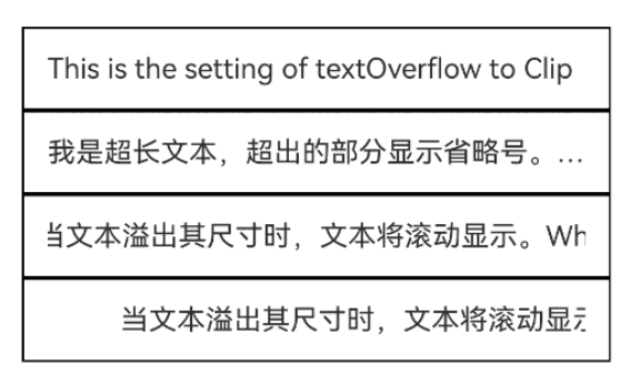
-
通过lineHeight属性设置文本行高。
Text('This is the text with the line height set. This is the text with the line height set.').width(300).fontSize(12).border({ width: 1 }).padding(10)Text('This is the text with the line height set. This is the text with the line height set.').width(300).fontSize(12).border({ width: 1 }).padding(10).lineHeight(20)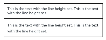
-
通过decoration属性设置文本装饰线样式、颜色及其粗细。
Text('This is the text').decoration({type: TextDecorationType.LineThrough,color: Color.Red}).borderWidth(1).padding(15).margin(5)Text('This is the text').decoration({type: TextDecorationType.Overline,color: Color.Red}).borderWidth(1).padding(15).margin(5)Text('This is the text').decoration({type: TextDecorationType.Underline,color: Color.Red}).borderWidth(1).padding(15).margin(5)Text('This is the text').decoration({type: TextDecorationType.Underline,color: Color.Blue,style: TextDecorationStyle.DASHED}).borderWidth(1).padding(15).margin(5)Text('This is the text').decoration({type: TextDecorationType.Underline,color: Color.Blue,style: TextDecorationStyle.DOTTED}).borderWidth(1).padding(15).margin(5)Text('This is the text').decoration({type: TextDecorationType.Underline,color: Color.Blue,style: TextDecorationStyle.DOUBLE}).borderWidth(1).padding(15).margin(5)Text('This is the text').decoration({type: TextDecorationType.Underline,color: Color.Blue,style: TextDecorationStyle.WAVY,thicknessScale: 4}).borderWidth(1).padding(15).margin(5)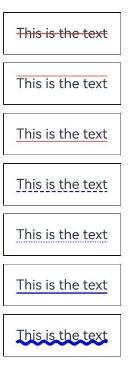
-
通过baselineOffset属性设置文本基线的偏移量。
Text('This is the text content with baselineOffset 0.').baselineOffset(0).fontSize(12).border({ width: 1 }).padding(10).width('100%').margin(5)Text('This is the text content with baselineOffset 30.').baselineOffset(30).fontSize(12).border({ width: 1 }).padding(10).width('100%').margin(5)Text('This is the text content with baselineOffset -20.').baselineOffset(-20).fontSize(12).border({ width: 1 }).padding(10).width('100%').margin(5)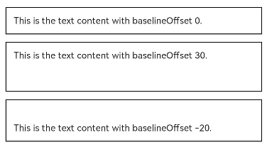
-
通过letterSpacing属性设置文本字符间距。
Text('This is the text content with letterSpacing 0.').letterSpacing(0).fontSize(12).border({ width: 1 }).padding(10).width('100%').margin(5)Text('This is the text content with letterSpacing 3.').letterSpacing(3).fontSize(12).border({ width: 1 }).padding(10).width('100%').margin(5)Text('This is the text content with letterSpacing -1.').letterSpacing(-1).fontSize(12).border({ width: 1 }).padding(10).width('100%').margin(5)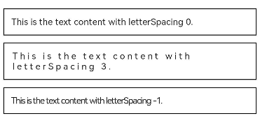
-
通过minFontSize与maxFontSize自适应字体大小。
minFontSize用于设置文本的最小显示字号,maxFontSize用于设置文本的最大显示字号。这两个属性必须同时设置才能生效,并且需要与maxLines属性或布局大小限制配合使用,单独设置任一属性将不会产生效果。
/* 请将$r('app.string.CustomTextStyle_textContent_one_style')替换为实际资源文件,* 在本示例中该资源文件的value值为"我的最大字号为30,最小字号为5,宽度为250,maxLines为1"*/Text($r('app.string.CustomTextStyle_textContent_one_style')).width(250).maxLines(1).maxFontSize(30).minFontSize(5).border({ width: 1 }).padding(10).margin(5)/* 请将$r('app.string.CustomTextStyle_textContent_two_style')替换为实际资源文件,* 在本示例中该资源文件的value值为"我的最大字号为30,最小字号为5,宽度为250,maxLines为2"*/Text($r('app.string.CustomTextStyle_textContent_two_style')).width(250).maxLines(2).maxFontSize(30).minFontSize(5).border({ width: 1 }).padding(10).margin(5)/* 请将$r('app.string.CustomTextStyle_textContent_no_max')替换为实际资源文件,* 在本示例中该资源文件的value值为"我的最大字号为30,最小字号为15,宽度为250,高度为50"*/Text($r('app.string.CustomTextStyle_textContent_no_max')).width(250).height(50).maxFontSize(30).minFontSize(15).border({ width: 1 }).padding(10).margin(5)/* 请将$r('app.string.CustomTextStyle_textContent_high')替换为实际资源文件,* 在本示例中该资源文件的value值为"我的最大字号为30,最小字号为15,宽度为250,高度为100"*/Text($r('app.string.CustomTextStyle_textContent_high')).width(250).height(100).maxFontSize(30).minFontSize(15).border({ width: 1 }).padding(10).margin(5)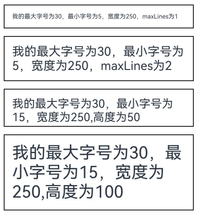
-
通过textCase属性设置文本大小写。
Text('This is the text content with textCase set to Normal.').textCase(TextCase.Normal).padding(10).border({ width: 1 }).padding(10).margin(5)// 文本全小写展示Text('This is the text content with textCase set to LowerCase.').textCase(TextCase.LowerCase).border({ width: 1 }).padding(10).margin(5)// 文本全大写展示Text('This is the text content with textCase set to UpperCase.').textCase(TextCase.UpperCase).border({ width: 1 }).padding(10).margin(5)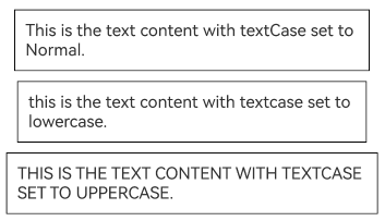
-
通过copyOption属性设置文本是否可复制粘贴。
// 请将$r('app.string.CustomTextStyle_textContent_incopy')替换为实际资源文件,在本示例中该资源文件的value值为"这是一段可复制文本。"Text($r('app.string.CustomTextStyle_textContent_incopy')).fontSize(30).copyOption(CopyOptions.InApp)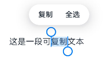
-
通过fontFamily属性设置字体列表。应用当前支持'HarmonyOS Sans'字体和注册自定义字体。
Text('This is the text content with fontFamily').fontSize(30).fontFamily('HarmonyOS Sans')
-
从API version 20开始,支持通过contentTransition属性设置数字翻牌效果。
@Entry@Componentexport struct ContentTransition {private static readonly INITIAL_SCORE: number = 98;@State number: number = ContentTransition.INITIAL_SCORE;@State numberTransition: NumericTextTransition =new NumericTextTransition({ flipDirection: FlipDirection.DOWN, enableBlur: false });build() {NavDestination() {Column() {Text(this.number + '').borderWidth(1).fontSize(40).contentTransition(this.numberTransition)Button('chang number').onClick(() => {this.number++}).margin(10)}.width('100%').height('100%')}// ···}}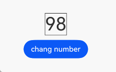
-
从API version 20开始,支持通过optimizeTrailingSpace设置是否在文本布局过程中优化每行末尾的空格,可解决行尾空格影响对齐显示效果问题。
Column() {// 启用优化行尾空格功能Text('Trimmed space enabled ').fontSize(30).fontWeight(FontWeight.Bold).margin({ top: 20 }).optimizeTrailingSpace(true).textAlign(TextAlign.Center)// 不启用优化行尾空格功能Text('Trimmed space disabled ').fontSize(30).fontWeight(FontWeight.Bold).margin({ top: 20 }).optimizeTrailingSpace(false).textAlign(TextAlign.Center)}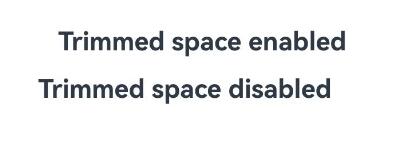
-
从API version 20开始,支持通过lineSpacing设置文本的行间距。当不配置LineSpacingOptions时,首行上方和尾行下方默认会有行间距,当onlyBetweenLines设置为true时,行间距仅适用于行与行之间,首行上方无额外的行间距。
import { LengthMetrics } from '@kit.ArkUI';@Extend(Text)function style() {.width(250).height(100).maxFontSize(30).minFontSize(15).border({ width: 1 })}@Entry@Componentexport struct LineSpacing {build() {NavDestination() {Column() {Text('The line spacing of this context is set to 20_px, and the spacing is effective only between the lines.').lineSpacing(LengthMetrics.px(20), { onlyBetweenLines: true }).style()}}// ···}}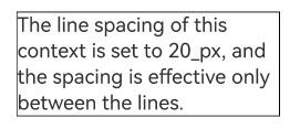
-
从API version 20开始,支持通过enableAutoSpacing设置是否开启中文与西文的自动间距。
@Entry@Componentexport struct EnableAutoSpacing {@State enableSpacing: boolean = false;build() {NavDestination() {Column() {Row({ space: 20 }) {// 请将$r('app.string.Enable_automatic_spacing')替换为实际资源文件,在本示例中该资源文件的value值为"开启自动间距"Button($r('app.string.Enable_automatic_spacing')).onClick(() => this.enableSpacing = true).backgroundColor(this.enableSpacing ? '#4CAF50' : '#E0E0E0').fontColor(this.enableSpacing ? Color.White : Color.Black)// 请将$r('app.string.off_automatic_spacing')替换为实际资源文件,在本示例中该资源文件的value值为"关闭自动间距"Button($r('app.string.off_automatic_spacing')).onClick(() => this.enableSpacing = false).backgroundColor(!this.enableSpacing ? '#F44336' : '#E0E0E0').fontColor(!this.enableSpacing ? Color.White : Color.Black)}.width('100%').justifyContent(FlexAlign.Center).margin({ top: 30, bottom: 20 })// 请将$r('app.string.Automatic_spacing_has_been_enabled')替换为实际资源文件,在本示例中该资源文件的value值为"当前状态:已开启自动间距"// 请将$r('app.string.Automatic_spacing_has_been_turned_off')替换为实际资源文件,在本示例中该资源文件的value值为"当前状态:已关闭自动间距"Text(this.enableSpacing ? $r('app.string.Automatic_spacing_has_been_enabled') : $r('app.string.Automatic_spacing_has_been_turned_off')).fontSize(16).fontColor(this.enableSpacing ? '#4CAF50' : '#F44336').margin({ bottom: 20 })// 设置是否应用中西文自动间距/* 请将$r('app.string.Chinese_and_Western_Auto_Spacing_automatic_spacing')替换为实际资源文件,* 在本示例中该资源文件的value值为"中西文Auto Spacing自动间距"*/Text($r('app.string.Chinese_and_Western_Auto_Spacing_automatic_spacing')).fontSize(24).padding(15).backgroundColor('#F5F5F5').width('90%').enableAutoSpacing(this.enableSpacing)}.width('100%').height('100%').padding(20)}// ...}}
-
从API version 20开始,支持通过shaderStyle设置渐变色。
@Entry@Componentexport struct ShaderStyle {@State message: string = 'Hello World';@State linearGradientOptions: LinearGradientOptions ={direction: GradientDirection.LeftTop,colors: [[Color.Red, 0.0], [Color.Blue, 0.3], [Color.Green, 0.5]],repeating: true,};build() {NavDestination() {Column({ space: 5 }) {// 请将$r('app.string.direction_LeftTop')替换为实际资源文件,在本示例中该资源文件的value值为"direction为LeftTop的线性渐变"Text($r('app.string.direction_LeftTop')).fontSize(18).width('90%').fontColor(0xCCCCCC).margin({ top: 40, left: 40 })Text(this.message).fontSize(50).width('80%').height(50).shaderStyle(this.linearGradientOptions)}.height('100%').width('100%')}// ...}}
添加事件
Text组件可以添加通用事件,可以绑定onClick、onTouch等事件来响应操作。
// xxx.ets
import { hilog } from '@kit.PerformanceAnalysisKit';
@Entry
@Component
export struct GeneralEvents {
  @State textStr1: string = '';
  @State textStr2: string = '';

  build() {
    NavDestination() {
      Row() {
        Column() {
          Text('This is a text component.')
            .fontSize(30)
            .onClick(() => {
              hilog.info(0x0000, 'Sample_TextComponent', 'Text onClick is triggering');
              this.textStr1 = 'Text onClick is triggering';
            })
            .onTouch(() => {
              hilog.info(0x0000, 'Sample_TextComponent', 'Text onTouch is triggering');
              this.textStr2 = 'Text onTouch is triggering';
            })
          Text('onClick:' + this.textStr1)
            .fontSize(20)
          Text('onTouch:' + this.textStr2)
            .fontSize(20)
        }.width('100%')
      }
      .height('100%')
    }
    // ···
  }
}

设置垂直居中
从API version 20开始,Text组件支持通过textVerticalAlign属性实现文本段落在垂直方向的对齐。
-
以下示例展示了如何通过textVerticalAlign属性设置文本垂直居中对齐效果。
// 请将$r('app.media.startIcon')替换为实际资源文件Text() {Span('Hello').fontSize(50)ImageSpan($r('app.media.startIcon')).width(30).height(30).verticalAlign(ImageSpanAlignment.FOLLOW_PARAGRAPH)Span('World')}.textVerticalAlign(TextVerticalAlign.CENTER)
设置选中菜单
弹出选中菜单
-
设置Text被选中时,会弹出包含复制、翻译、搜索的菜单。
Text组件需要设置copyOption属性才可以被选中。
// 请将$r('app.string.selected_menu')替换为实际资源文件,在本示例中该资源文件的value值为"这是一段文本,用来展示选中菜单"Text($r('app.string.selected_menu')).fontSize(30).copyOption(CopyOptions.InApp)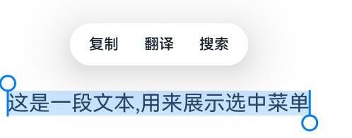
-
Text组件通过设置bindSelectionMenu属性绑定自定义选择菜单。
controller: TextController = new TextController();options: TextOptions = { controller: this.controller };// 请将$r('app.string.show_selected_menu')替换为实际资源文件,在本示例中该资源文件的value值为"这是一段文本,用来展示选中菜单"Text($r('app.string.show_selected_menu'), this.options).fontSize(30).copyOption(CopyOptions.InApp).bindSelectionMenu(TextSpanType.TEXT, this.RightClickTextCustomMenu, TextResponseType.RIGHT_CLICK, {onAppear: () => {// 请将$r('app.string.SelectMenu_Text_Ejected')替换为实际资源文件,在本示例中该资源文件的value值为"自定义选择菜单弹出时触发该回调"hilog.info(0x0000, 'Sample_TextComponent',this.getUIContext().getHostContext()!.resourceManager.getStringSync($r('app.string.SelectMenu_Text_Ejected').id));},onDisappear: () => {// 'SelectMenu_Text_Close'资源文件中的value值为'自定义选择菜单关闭时触发该回调'hilog.info(0x0000, 'Sample_TextComponent',this.getUIContext().getHostContext()!.resourceManager.getStringSync($r('app.string.SelectMenu_Text_Close').id));}})// 定义菜单项@BuilderRightClickTextCustomMenu() {Column() {Menu() {MenuItemGroup() {// 请将$r('app.media.app_icon')替换为实际资源文件MenuItem({ startIcon: $r('app.media.app_icon'), content: 'CustomMenu One', labelInfo: '' }).onClick(() => {// 使用closeSelectionMenu接口关闭菜单this.controller.closeSelectionMenu();})MenuItem({ startIcon: $r('app.media.app_icon'), content: 'CustomMenu Two', labelInfo: '' })MenuItem({ startIcon: $r('app.media.app_icon'), content: 'CustomMenu Three', labelInfo: '' })}}.backgroundColor('#F0F0F0')}}
-
Text组件通过设置editMenuOptions属性扩展自定义选择菜单,可以设置扩展项的文本内容、图标以及回调方法。
// 请将$r('app.string.show_selected_menu')替换为实际资源文件,在本示例中该资源文件的value值为"这是一段文本,用来展示选中菜单"Text($r('app.string.show_selected_menu')).fontSize(20).copyOption(CopyOptions.LocalDevice).editMenuOptions({onCreateMenu: this.onCreateMenu, onMenuItemClick: this.onMenuItemClick})// 定义onCreateMenu,onMenuItemClick// 请将$r('app.media.app_icon')替换为实际资源文件onCreateMenu = (menuItems: Array<TextMenuItem>) => {let item1: TextMenuItem = {content: 'customMenu1',icon: $r('app.media.app_icon'),id: TextMenuItemId.of('customMenu1'),};let item2: TextMenuItem = {content: 'customMenu2',id: TextMenuItemId.of('customMenu2'),icon: $r('app.media.app_icon'),};menuItems.push(item1);menuItems.unshift(item2);return menuItems;}onMenuItemClick = (menuItem: TextMenuItem, textRange: TextRange) => {if (menuItem.id.equals(TextMenuItemId.of('customMenu2'))) {// 请将$r('app.string.SelectMenu_Text_customMenu')替换为实际资源文件,在本示例中该资源文件的value值为"拦截 id: customMenu2 start:"hilog.info(0x0000, 'Sample_TextComponent',this.getUIContext().getHostContext()!.resourceManager.getStringSync($r('app.string.SelectMenu_Text_customMenu').id) + textRange.start + '; end:' +textRange.end);return true;}if (menuItem.id.equals(TextMenuItemId.COPY)) {// 请将$r('app.string.SelectMenu_Text_copy')替换为实际资源文件,在本示例中该资源文件的value值为"拦截 COPY start:"hilog.info(0x0000, 'Sample_TextComponent',this.getUIContext().getHostContext()!.resourceManager.getStringSync($r('app.string.SelectMenu_Text_copy').id) +textRange.start + '; end:' + textRange.end);return true;}if (menuItem.id.equals(TextMenuItemId.SELECT_ALL)) {// 请将$r('app.string.SelectMenu_Text_SelectionAll')替换为实际资源文件,在本示例中该资源文件的value值为"不拦截 SELECT_ALL start:"hilog.info(0x0000, 'Sample_TextComponent',this.getUIContext().getHostContext()!.resourceManager.getStringSync($r('app.string.SelectMenu_Text_SelectionAll').id) +textRange.start + '; end:' +textRange.end);return false;}return false;};
关闭选中菜单
使用Text组件时,若需要实现点击空白处关闭选中的场景,分为以下两种情况:
-
在Text组件区域内点击空白处,会正常关闭选中态和菜单;
-
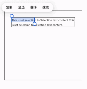
在Text组件区域外点击空白处,前提是Text组件设置selection属性,具体示例如下:
// xxx.ets@Entry@Componentexport struct SelectionChange {@State text: string ='This is set selection to Selection text content This is set selection to Selection text content.';@State start: number = 0;@State end: number = 20;build() {NavDestination() {Flex({ direction: FlexDirection.Column, alignItems: ItemAlign.Start, justifyContent: FlexAlign.Start }) {Text(this.text).fontSize(12).border({ width: 1 }).lineHeight(20).margin(30).copyOption(CopyOptions.InApp).selection(this.start, this.end).onTextSelectionChange((selectionStart, selectionEnd) => {// 更新选中态位置this.start = selectionStart;this.end = selectionEnd;})}.height(600).width(335).borderWidth(1).onClick(() => {// 监听父组件的点击事件,将选中首尾位置均设置为-1,即可清除选中this.start = -1;this.end = -1;})}// ···}}
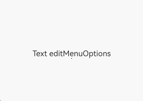
屏蔽系统菜单回调和自定义扩展菜单
从API version 12开始,支持通过editMenuOptions屏蔽系统菜单回调和自定义扩展菜单项。
// xxx.ets
@Entry
@Component
export struct CustomAndBlockMenus {
  private static readonly CREATE_MENU_ITEM_ID_1: string = 'create1';
  private static readonly CREATE_MENU_ITEM_ID_2: string = 'create2';
  private static readonly PREPARE_MENU_ITEM_ID: string = 'prepare1';
  private controller: TextController = new TextController();
  @State private text: string = 'Text editMenuOptions';
  @State private endIndex: number = 0;
  @State blockCallbackText: string = '';

  // 创建菜单项辅助方法
  private createMenuItem(id: string, content: string): TextMenuItem {
    // $r('app.media.startIcon')需要替换为开发者所需的图像资源文件
    return {
      content: content,
      icon: $r('app.media.startIcon'),
      id: TextMenuItemId.of(id)
    };
  }

  // 查找菜单项索引
  private findMenuItemIndex(menuItems: Array<TextMenuItem>, menuItemId: TextMenuItemId): number {
    return menuItems.findIndex((item: TextMenuItem) => item.id.equals(menuItemId));
  }

  // 创建菜单回调
  private onCreateMenu = (menuItems: Array<TextMenuItem>): Array<TextMenuItem> => {
    const createItem1: TextMenuItem = this.createMenuItem(
      CustomAndBlockMenus.CREATE_MENU_ITEM_ID_1,
      'create1'
    );

    const createItem2: TextMenuItem = this.createMenuItem(
      CustomAndBlockMenus.CREATE_MENU_ITEM_ID_2,
      'create2'
    );

    // 添加自定义菜单项
    menuItems.push(createItem1);
    menuItems.unshift(createItem2);

    // 移除不需要的系统菜单项
    this.removeMenuItemById(menuItems, TextMenuItemId.AI_WRITER);
    this.removeMenuItemById(menuItems, TextMenuItemId.TRANSLATE);

    return menuItems;
  }

  // 移除指定菜单项
  private removeMenuItemById(menuItems: Array<TextMenuItem>, menuItemId: TextMenuItemId): void {
    const targetIndex: number = this.findMenuItemIndex(menuItems, menuItemId);
    if (targetIndex !== -1) {
      menuItems.splice(targetIndex, 1);
    }
  }

  // 菜单项点击回调
  private onMenuItemClick = (menuItem: TextMenuItem, textRange: TextRange): boolean => {
    const menuItemId: TextMenuItemId = menuItem.id;

    // 处理自定义菜单项,return false,点击自定义菜单项后菜单会关闭
    if (menuItemId.equals(TextMenuItemId.of(CustomAndBlockMenus.CREATE_MENU_ITEM_ID_2))) {
      let msg = '拦截 id: create2 start:' + textRange.start + '; end:' + textRange.end;
      this.blockCallbackText = msg;
      return false;
    }
    // 处理自定义菜单项,return true,点击自定义菜单项后菜单不会关闭
    if (menuItemId.equals(TextMenuItemId.of(CustomAndBlockMenus.PREPARE_MENU_ITEM_ID))) {
      let msg = '拦截 id: prepare1 start:' + textRange.start + '; end:+' + textRange.end;
      this.blockCallbackText = msg;
      return true;
    }

    // 处理系统菜单项,return true,拦截系统默认逻辑,此时点击复制菜单不会关闭
    if (menuItemId.equals(TextMenuItemId.COPY)) {
      let msg = '拦截 COPY start:' + textRange.start + '; end:' + textRange.end;
      this.blockCallbackText = msg;
      // 可以通过文本控制器关闭菜单,手柄也会消失,仅保持选中区域,点击可消失
      this.controller.closeSelectionMenu();
      return true;
    }
    // 处理系统菜单项,return false,不拦截系统默认逻辑,自定义逻辑亦会被执行
    if (menuItemId.equals(TextMenuItemId.SELECT_ALL)) {
      let msg = '不拦截 SELECT_ALL start:' + textRange.start + '; end:' + textRange.end;
      this.blockCallbackText = msg;
      return false;
    }

    return false;
  }
  // 准备菜单回调
  private onPrepareMenu = (menuItems: Array<TextMenuItem>): Array<TextMenuItem> => {
    const prepareItem: TextMenuItem = this.createMenuItem(
      CustomAndBlockMenus.PREPARE_MENU_ITEM_ID,
      `prepare1_${this.endIndex}`
    );

    menuItems.unshift(prepareItem);
    return menuItems;
  }
  // 编辑菜单选项
  @State private editMenuOptions: EditMenuOptions = {
    onCreateMenu: this.onCreateMenu,
    onMenuItemClick: this.onMenuItemClick,
    onPrepareMenu: this.onPrepareMenu
  };
  // 文本选择变化回调
  private onTextSelectionChange = (selectionStart: number, selectionEnd: number): void => {
    this.endIndex = selectionEnd;
  }

  build() {
    NavDestination() {
      Column() {
        Text(this.text, { controller: this.controller })
          .fontSize(20)
          .copyOption(CopyOptions.LocalDevice)
          .editMenuOptions(this.editMenuOptions)
          .margin({ top: 100 })
          .onTextSelectionChange(this.onTextSelectionChange)
        Text(this.blockCallbackText).borderWidth(1)
      }
      .width('90%')
      .margin('5%')
    }
  }
}
屏蔽系统服务类菜单
-
从API version 20开始,支持通过disableSystemServiceMenuItems屏蔽文本选择菜单内所有系统服务菜单项。
import { TextMenuController } from '@kit.ArkUI';// xxx.ets@Entry@Componentexport struct ServiceMenuItems {aboutToAppear(): void {// 禁用所有系统服务菜单TextMenuController.disableSystemServiceMenuItems(true);}aboutToDisappear(): void {// 页面消失恢复系统服务菜单TextMenuController.disableSystemServiceMenuItems(false);}build() {NavDestination() {Row() {Column() {// 请将$r('app.string.Service_MenuItems_Text')替换为实际资源文件,在本示例中该资源文件的value值为"这是一段文本,长按弹出文本选择菜单。"Text($r('app.string.Service_MenuItems_Text')).height(60).fontStyle(FontStyle.Italic).fontWeight(FontWeight.Bold).textAlign(TextAlign.Center).copyOption(CopyOptions.InApp).editMenuOptions({onCreateMenu: (menuItems: Array<TextMenuItem>) => {// menuItems不包含被屏蔽的系统菜单项return menuItems;},onMenuItemClick: (menuItem: TextMenuItem, textRange: TextRange) => {return false;}})}.width('100%')}.height('100%')}// ...}}
-
从API version 20开始,支持通过disableMenuItems屏蔽文本选择菜单内指定的系统服务菜单项。
import { TextMenuController } from '@kit.ArkUI';// xxx.ets@Entry@Componentexport struct DisableMenuItems {aboutToAppear(): void {// 禁用搜索菜单TextMenuController.disableMenuItems([TextMenuItemId.SEARCH])}aboutToDisappear(): void {// 恢复系统服务菜单TextMenuController.disableMenuItems([])}build() {NavDestination() {Row() {Column() {// 请将$r('app.string.Service_MenuItems_Text')替换为实际资源文件,在本示例中该资源文件的value值为"这是一段文本,长按弹出文本选择菜单。"Text($r('app.string.Service_MenuItems_Text')).height(60).fontStyle(FontStyle.Italic).fontWeight(FontWeight.Bold).textAlign(TextAlign.Center).copyOption(CopyOptions.InApp).editMenuOptions({onCreateMenu: (menuItems: Array<TextMenuItem>) => {// menuItems不包含搜索return menuItems;},onMenuItemClick: (menuItem: TextMenuItem, textRange: TextRange) => {return false}})}.width('100%')}.height('100%')}// ...}}
默认菜单支持自定义刷新能力
从API version 20开始,当文本选择区域变化后显示菜单之前触发onPrepareMenu回调,可在该回调中进行菜单数据设置。
// 请将$r('app.media.xxx')替换为实际资源文件
// xxx.ets
import { hilog } from '@kit.PerformanceAnalysisKit';
const DOMAIN = 0x0000;
@Entry
@Component

export struct PrepareMenu {
  @State text: string = 'Text editMenuOptions';
  @State endIndex: number = 0;
  onCreateMenu = (menuItems: Array<TextMenuItem>) => {
    let item1: TextMenuItem = {
      content: 'create1',
      icon: $r('app.media.startIcon'),
      id: TextMenuItemId.of('create1'),
    };
    let item2: TextMenuItem = {
      content: 'create2',
      id: TextMenuItemId.of('create2'),
      icon: $r('app.media.startIcon'),
    };
    menuItems.push(item1);
    menuItems.unshift(item2);
    return menuItems;
  }
  onMenuItemClick = (menuItem: TextMenuItem, textRange: TextRange) => {
    if (menuItem.id.equals(TextMenuItemId.of('create2'))) {
      hilog.info(DOMAIN, 'testTag', '%{public}s', 'intercept id: create2 start:' + textRange.start + '; end:' + textRange.end);
      return true;
    }
    if (menuItem.id.equals(TextMenuItemId.of('prepare1'))) {
      hilog.info(DOMAIN, 'testTag', '%{public}s', 'intercept id: prepare1 start:' + textRange.start + '; end:' + textRange.end);
      return true;
    }
    if (menuItem.id.equals(TextMenuItemId.COPY)) {
      hilog.info(DOMAIN, 'testTag', '%{public}s', 'intercept COPY start:' + textRange.start + '; end:' + textRange.end);
      return true;
    }
    if (menuItem.id.equals(TextMenuItemId.SELECT_ALL)) {
      hilog.info(DOMAIN, 'testTag', '%{public}s', 'No interception SELECT_ALL start:' + textRange.start + '; end:' + textRange.end);
      return false;
    }
    return false;
  }
  onPrepareMenu = (menuItems: Array<TextMenuItem>) => {
    let item1: TextMenuItem = {
      content: 'prepare1_' + this.endIndex,
      icon: $r('app.media.startIcon'),
      id: TextMenuItemId.of('prepare1'),
    };
    menuItems.unshift(item1);
    return menuItems;
  }
  @State editMenuOptions: EditMenuOptions = {
    onCreateMenu: this.onCreateMenu,
    onMenuItemClick: this.onMenuItemClick,
    onPrepareMenu: this.onPrepareMenu
  };

  build() {
    NavDestination() {
    Column() {
      Text(this.text)
        .fontSize(20)
        .copyOption(CopyOptions.LocalDevice)
        .editMenuOptions(this.editMenuOptions)
        .margin({ top: 100 })
        .onTextSelectionChange((selectionStart: number, selectionEnd: number) => {
          this.endIndex = selectionEnd;
        })
    }
    .width('90%')
    .margin('5%')
    }
    // ...
  }
}
设置AI菜单
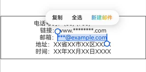
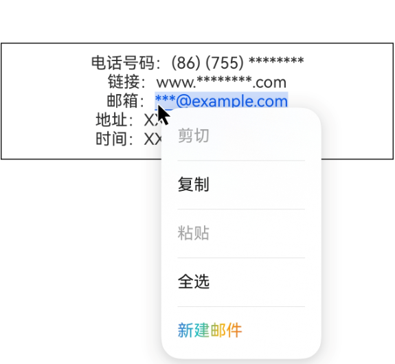
Text组件通过enableDataDetector和dataDetectorConfig属性实现AI菜单的显示。AI菜单的表现形式包括:单击AI实体(指可被识别的内容,包括地址、邮箱等)弹出菜单的实体识别选项,选中文本后,文本选择菜单与鼠标右键菜单中显示的实体识别选项。
从API version 20开始,支持在文本选择菜单与鼠标右键菜单中显示实体识别选项。当enableDataDetector设置为true,且copyOption设置为CopyOptions.LocalDevice时,该功能生效。菜单选项包括TextMenuItemId中的url(打开链接)、email(新建邮件)、phoneNumber(呼叫)、address(导航至该位置)、dateTime(新建日程提醒)。
该功能生效时,需选中范围内,包括一个完整的AI实体,才能展示对应的选项。
-
如果需要单击AI实体弹出菜单的实体识别选项,可以配置enableDataDetector为true。
-
如果在单击的交互方式之外,还需要文本选择菜单与鼠标右键菜单中显示的实体识别选项,可以配置enableDataDetector为true,且copyOption设置为CopyOptions.LocalDevice,具体示例如下所示:
// 'app.string.AIMenu_Text_One'资源文件中的value值为'电话号码:(86) (755) ******** \n \n 链接:www.********.com// \n \n 邮箱:***@example.com\n \n 地址:XX省XX市XX区XXXX \n \n 时间:XX年XX月XX日XXXX'Text($r('app.string.AIMenu_Text_One')).fontSize(16).copyOption(CopyOptions.LocalDevice).enableDataDetector(true)// 使能实体识别.dataDetectorConfig({// 配置识别样式// types可支持PHONE_NUMBER电话号码、URL链接、EMAIL邮箱、ADDRESS地址、DATE_TIME时间// types设置为null或者[]时,识别所有类型的实体types: [], onDetectResultUpdate: (result: string) => {}}) -
如果需要调整识别出的样式,可以通过dataDetectorConfig实现,具体可以参考TextDataDetectorConfig配置项。
-
如果需要调整菜单的位置,可以通过editMenuOptions实现,具体可以参考示例文本扩展自定义菜单。
实现热搜榜
该示例通过maxLines、textOverflow、textAlign、constraintSize属性展示了热搜榜的效果。
import { ComponentCard } from '../../common/Card';

@Entry
@Component
export struct TextHotSearch {
  build() {
    NavDestination() {
      Column({ space: 12 }) {
        // ...
          Column() {
            Row() {
              Text('1').fontSize(14).fontColor(Color.Red).margin({ left: 10, right: 10 })
              // 请将$r('app.string.TextHotSearch_textContent_one')替换为实际资源文件,在本示例中该资源文件的value值为"我是热搜词条1"
              Text($r('app.string.TextHotSearch_textContent_one'))
                .fontSize(12)
                .fontColor(Color.Blue)
                .maxLines(1)
                .textOverflow({ overflow: TextOverflow.Ellipsis })
                .fontWeight(300)
              // 请将$r('app.string.TextHotSearch_textContent_two')替换为实际资源文件,在本示例中该资源文件的value值为"爆"
              Text($r('app.string.TextHotSearch_textContent_two'))
                .margin({ left: 6 })
                .textAlign(TextAlign.Center)
                .fontSize(10)
                .fontColor(Color.White)
                .fontWeight(600)
                .backgroundColor(0x770100)
                .borderRadius(5)
                .width(15)
                .height(14)
            }.width('100%').margin(5)

            Row() {
              Text('2').fontSize(14).fontColor(Color.Red).margin({ left: 10, right: 10 })
              /* 请将$r('app.string.TextHotSearch_textContent_three')替换为实际资源文件,
               * 在本示例中该资源文件的value值为"我是热搜词条2 我是热搜词条2 我是热搜词条2 我是热搜词条2 我是热搜词条2"
               */
              Text($r('app.string.TextHotSearch_textContent_three'))
                .fontSize(12)
                .fontColor(Color.Blue)
                .fontWeight(300)
                .constraintSize({ maxWidth: 200 })
                .maxLines(1)
                .textOverflow({ overflow: TextOverflow.Ellipsis })
              // 请将$r('app.string.TextHotSearch_textContent_four')替换为实际资源文件,在本示例中该资源文件的value值为"热"
              Text($r('app.string.TextHotSearch_textContent_four'))
                .margin({ left: 6 })
                .textAlign(TextAlign.Center)
                .fontSize(10)
                .fontColor(Color.White)
                .fontWeight(600)
                .backgroundColor(0xCC5500)
                .borderRadius(5)
                .width(15)
                .height(14)
            }.width('100%').margin(5)

            Row() {
              Text('3').fontSize(14).fontColor(Color.Orange).margin({ left: 10, right: 10 })
              // 请将$r('app.string.TextHotSearch_textContent_five')替换为实际资源文件,在本示例中该资源文件的value值为"我是热搜词条3"
              Text($r('app.string.TextHotSearch_textContent_five'))
                .fontSize(12)
                .fontColor(Color.Blue)
                .fontWeight(300)
                .maxLines(1)
                .constraintSize({ maxWidth: 200 })
                .textOverflow({ overflow: TextOverflow.Ellipsis })
              // 请将$r('app.string.TextHotSearch_textContent_four')替换为实际资源文件,在本示例中该资源文件的value值为"热"
              Text($r('app.string.TextHotSearch_textContent_four'))
                .margin({ left: 6 })
                .textAlign(TextAlign.Center)
                .fontSize(10)
                .fontColor(Color.White)
                .fontWeight(600)
                .backgroundColor(0xCC5500)
                .borderRadius(5)
                .width(15)
                .height(14)
            }.width('100%').margin(5)

            Row() {
              Text('4').fontSize(14).fontColor(Color.Grey).margin({ left: 10, right: 10 })
              /* 请将$r('app.string.TextHotSearch_textContent_six')替换为实际资源文件,
               * 在本示例中该资源文件的value值为"我是热搜词条4 我是热搜词条4 我是热搜词条4 我是热搜词条4 我是热搜词条4"
               */
              Text($r('app.string.TextHotSearch_textContent_six'))
                .fontSize(12)
                .fontColor(Color.Blue)
                .fontWeight(300)
                .constraintSize({ maxWidth: 200 })
                .maxLines(1)
                .textOverflow({ overflow: TextOverflow.Ellipsis })
            }.width('100%').margin(5)
          }.width('100%')
        // ...
      }
      .width('100%')
      .height('100%')
      .padding({ left: 12, right: 12 })
    }
    // ...
  }
}