选项卡 (Tabs)
当页面信息较多时,为了让用户能够聚焦于当前显示的内容,需要对页面内容进行分类,提高页面空间利用率。Tabs组件可以在一个页面内快速实现视图内容的切换,一方面提升查找信息的效率,另一方面精简用户单次获取到的信息量。
基本布局
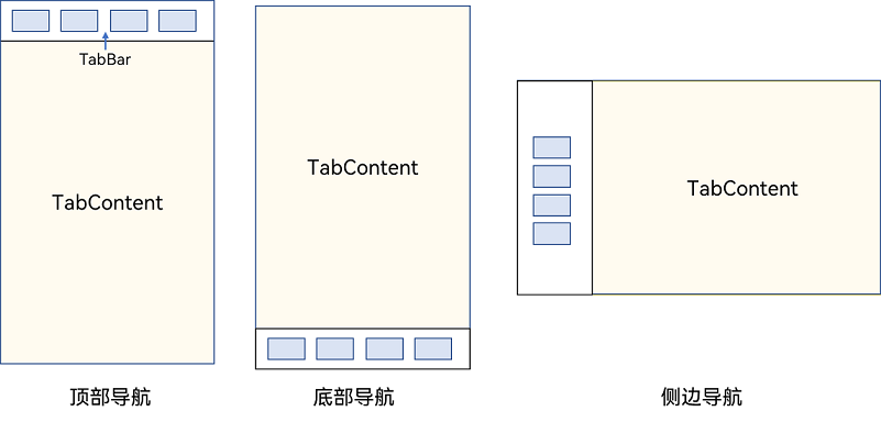
Tabs组件的页面组成包含两个部分,分别是TabContent和TabBar。TabContent是内容页,TabBar是导航页签栏,页面结构如下图所示,根据不同的导航类型,布局会有区别,可以分为底部导航、顶部导航、侧边导航,其导航栏分别位于底部、顶部和侧边。
图1 Tabs组件布局示意图
- TabContent组件不支持设置通用宽度属性,其宽度默认撑满Tabs父组件。
- TabContent组件不支持设置通用高度属性,其高度由Tabs父组件高度与TabBar组件高度决定。
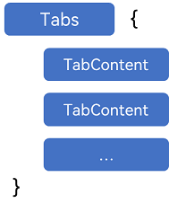
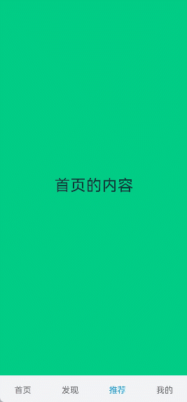
Tabs使用花括号包裹TabContent,如图2,其中TabContent显示相应的内容页。
图2 Tabs与TabContent使用
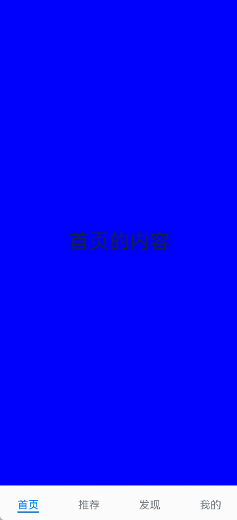
每一个TabContent对应的内容需要有一个页签,可以通过TabContent的tabBar属性进行配置。在如下TabContent组件上设置tabBar属性,可以设置其对应页签中的内容,tabBar作为内容的页签。
TabContent() {
  // app.string.homepage_content资源文件中的value值为“首页的内容”
  Text($r('app.string.homepage_content'))
    .fontSize(30)
}
// app.string.homepage资源文件中的value值为“首页”
.tabBar($r('app.string.homepage'))
设置多个内容时,需在Tabs内按照顺序放置。
Tabs() {
  TabContent() {
    // app.string.homepage_content资源文件中的value值为“首页的内容”
    Text($r('app.string.homepage_content'))
      .fontSize(30)
  }
  // app.string.homepage资源文件中的value值为“首页”
  .tabBar($r('app.string.homepage'))

  TabContent() {
    // app.string.recommend_content资源文件中的value值为“推荐的内容”
    Text($r('app.string.recommend_content'))
      .fontSize(30)
  }
  // app.string.recommend资源文件中的value值为“推荐”
  .tabBar($r('app.string.recommend'))

  TabContent() {
    // app.string.discover_content资源文件中的value值为“发现的内容”
    Text($r('app.string.discover_content'))
      .fontSize(30)
  }
  // app.string.discover资源文件中的value值为“发现”
  .tabBar($r('app.string.discover'))

  TabContent() {
    // app.string.mine_content资源文件中的value值为“我的内容”
    Text($r('app.string.mine_content'))
      .fontSize(30)
  }
  // app.string.mine_content资源文件中的value值为“我的”
  .tabBar($r('app.string.mine'))
}
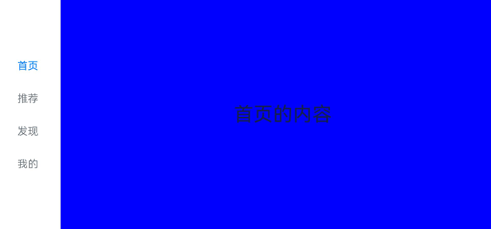
底部导航
底部导航是应用中最常见的一种导航方式。底部导航位于应用一级页面的底部,用户打开应用,能够分清整个应用的功能分类,以及页签对应的内容,并且其位于底部更加方便用户单手操作。底部导航一般作为应用的主导航形式存在,其作用是将用户关心的内容按照功能进行分类,迎合用户使用习惯,方便在不同模块间的内容切换。
图3 底部导航栏
导航栏位置使用Tabs的barPosition参数进行设置。默认情况下,导航栏位于顶部,此时,barPosition为BarPosition.Start。设置为底部导航时,需要将barPosition设置为BarPosition.End。
Tabs({ barPosition: BarPosition.End }) {
  // TabContent的内容:首页、发现、推荐、我的
  // ···
}
底部导航栏可通过设置TabContent的BottomTabBarStyle来实现底部页签样式,详细示例请参考:示例9(设置底部页签使用symbol图标)。
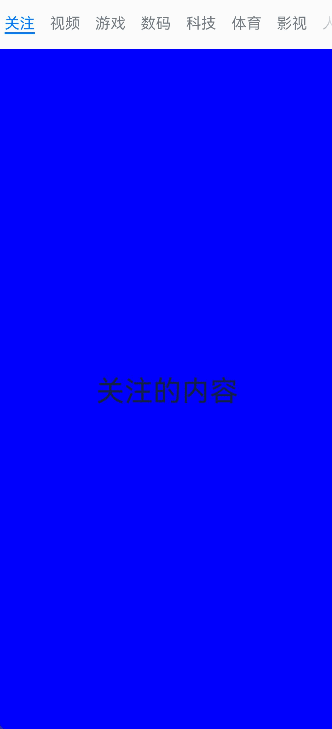
顶部导航
当内容分类较多,用户对不同内容的浏览概率相差不大,需要经常快速切换时,一般采用顶部导航模式进行设计,作为对底部导航内容的进一步划分,常见一些资讯类应用对内容的分类为关注、视频、数码,或者主题应用中对主题进行进一步划分为图片、视频、字体等。
图4 顶部导航栏
Tabs({ barPosition: BarPosition.Start }) {
  // TabContent的内容:关注、视频、游戏、数码、科技、体育、影视
  // ···
}
侧边导航
侧边导航是应用较为少见的一种导航模式,更多适用于横屏界面,用于对应用进行导航操作,由于用户的视觉习惯是从左到右,侧边导航栏默认为左侧侧边栏。
图5 侧边导航栏
实现侧边导航栏需要将Tabs的vertical属性设置为true,vertical默认值为false,表明内容页和导航栏垂直方向排列。
  Tabs({ barPosition: BarPosition.Start }) {
    // TabContent的内容:首页、发现、推荐、我的
    // ···
  }
// ···
  .vertical(true)
  .barWidth(100)
  .barHeight(200)
- vertical为false时,tabbar的宽度默认为撑满屏幕的宽度,需要设置barWidth为合适值。
- vertical为true时,tabbar的高度默认为实际内容的高度,需要设置barHeight为合适值。
限制导航栏的滑动切换
默认情况下,导航栏都支持滑动切换,在一些内容信息量需要进行多级分类的页面,如支持底部导航+顶部导航组合的情况下,底部导航栏的滑动效果与顶部导航出现冲突,此时需要限制底部导航的滑动,避免引起不好的用户体验。
图6 限制底部导航栏滑动
控制滑动切换的属性为scrollable,默认值为true,表示可以滑动,若要限制滑动切换页签则需要设置为false。
  Tabs({ barPosition: BarPosition.End }) {
    TabContent() {
      Column() {
        Tabs() {
          // 顶部导航栏内容
        // ···
        }
      }
      .backgroundColor('#ff08a8f1')
      .width('100%')
    }
    // app.string.homepage资源文件中的value值为“首页”
    .tabBar($r('app.string.homepage'))

    // 其他TabContent内容:发现、推荐、我的
    // ···
  }
// ···
  .scrollable(false)
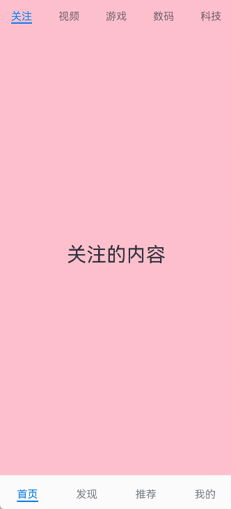
固定导航栏
当内容分类较为固定且不具有拓展性时,例如底部导航内容分类一般固定,分类数量一般在3-5个,此时使用固定导航栏。固定导航栏不可滚动,无法被拖拽滚动,内容均分tabBar的宽度。
图7 固定导航栏

Tabs的barMode属性用于控制导航栏是否可以滚动,默认值为BarMode.Fixed。
Tabs({ barPosition: BarPosition.End }) {
  // TabContent的内容:首页、发现、推荐、我的
  // ···
}
.barMode(BarMode.Fixed)
滚动导航栏
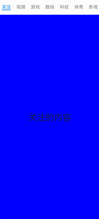
滚动导航栏可以用于顶部导航栏或者侧边导航栏的设置,内容分类较多,屏幕宽度无法容纳所有分类页签的情况下,需要使用可滚动的导航栏,支持用户点击和滑动来加载隐藏的页签内容。
图8 可滚动导航栏
滚动导航栏需要设置Tabs组件的barMode属性,默认值为BarMode.Fixed表示为固定导航栏,BarMode.Scrollable表示可滚动导航栏。
Tabs({ barPosition: BarPosition.Start }) {
  // TabContent的内容:关注、视频、游戏、数码、科技、体育、影视、人文、艺术、自然、军事
  // ···
}
.barMode(BarMode.Scrollable)
自定义导航栏
对于底部导航栏,一般作为应用主页面功能区分,为了更好的用户体验,会组合文字以及对应语义图标表示页签内容,这种情况下,需要自定义导航页签的样式。
图9 自定义导航栏

系统默认情况下采用了下划线标识当前活跃的页签,而自定义导航栏需要自行实现相应的样式,用于区分当前活跃页签和未活跃页签。
设置自定义导航栏需要使用tabBar的参数,以其支持的CustomBuilder的方式传入自定义的函数组件样式。例如这里声明tabBuilder的自定义函数组件,传入参数包括页签文字title,对应位置index,以及选中状态和未选中状态的图片资源。通过当前活跃的currentIndex和页签对应的targetIndex匹配与否,决定UI显示的样式。
@State currentIndex: number = 0;

@Builder
tabBuilder(title: ResourceStr, targetIndex: number, selectedImg: Resource, normalImg: Resource) {
  Column() {
    Image(this.currentIndex === targetIndex ? selectedImg : normalImg)
      .size({ width: 25, height: 25 })
    Text(title)
      .fontColor(this.currentIndex === targetIndex ? '#1698CE' : '#6B6B6B')
  }
  .width('100%')
  .height(50)
  .justifyContent(FlexAlign.Center)
}
在TabContent对应tabBar属性中传入自定义函数组件,并传递相应的参数。
TabContent() {
  Column() {
    // app.string.mine_content资源文件中的value值为“我的内容”
    Text($r('app.string.mine_content'))
  }
  .width('100%')
  .height('100%')
  .backgroundColor('#007DFF')
}
// app.string.mine资源文件中的value值为“我的”
.tabBar(this.tabBuilder($r('app.string.mine'), 0, $r('app.media.mine_selected'), $r('app.media.mine_normal')))
切换至指定页签
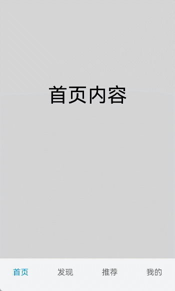
在不使用自定义导航栏时,默认的Tabs会实现切换逻辑。在使用了自定义导航栏后,默认的Tabs仅实现滑动内容页和点击页签时内容页的切换逻辑,页签切换逻辑需要自行实现。即用户滑动内容页和点击页签时,页签栏需要同步切换至内容页对应的页签。
图10 内容页和页签不联动
从API version 18开始,支持使用Tabs提供的onSelected事件方法,监听索引index的变化,并将选中元素的index值传递给selectIndex,实现页签的切换。
// 如需作为页面入口,请取消@Entry的注释并删除export关键字
// @Entry
@Component
export struct ContentPageNoAndTabLinkage {

  @State selectIndex: number = 0;
  @Builder tabBuilder(title: Resource, targetIndex: number) {
    Column() {
      Text(title)
        .fontColor(this.selectIndex === targetIndex ? '#1698CE' : '#6B6B6B')
    }
  }
  build() {
    NavDestination() {
      Column({ space: 12 }) {
        // ...
          Tabs({ barPosition: BarPosition.End }) {
            TabContent() {
              // app.string.homepage_content资源文件中的value值为“首页内容”
              Text($r('app.string.homepage_content')).width('100%').height('100%').backgroundColor('rgb(213,213,213)')
                .fontSize(40).fontColor(Color.Black).textAlign(TextAlign.Center)
            // app.string.homepage资源文件中的value值为“首页”
            }.tabBar(this.tabBuilder($r('app.string.homepage'), 0))

            TabContent() {
              // app.string.discover_content资源文件中的value值为“发现内容”
              Text($r('app.string.discover_content')).width('100%').height('100%').backgroundColor('rgb(112,112,112)')
                .fontSize(40).fontColor(Color.Black).textAlign(TextAlign.Center)
            // app.string.discover资源文件中的value值为“发现”
            }.tabBar(this.tabBuilder($r('app.string.discover'), 1))

            TabContent() {
              // app.string.recommend_content资源文件中的value值为“推荐内容”
              Text($r('app.string.recommend_content')).width('100%').height('100%').backgroundColor('rgb(39,135,217)')
                .fontSize(40).fontColor(Color.Black).textAlign(TextAlign.Center)
            // app.string.recommend资源文件中的value值为“推荐”
            }.tabBar(this.tabBuilder($r('app.string.recommend'), 2))

            TabContent() {
              // app.string.mine_content资源文件中的value值为“我的内容”
              Text($r('app.string.mine_content')).width('100%').height('100%').backgroundColor('rgb(0,74,175)')
                .fontSize(40).fontColor(Color.Black).textAlign(TextAlign.Center)
            }
            // app.string.mine资源文件中的value值为“我的”
            .tabBar(this.tabBuilder($r('app.string.mine'), 3))
          }
          .animationDuration(0)
          .backgroundColor('#F1F3F5')
          .onSelected((index: number) => {
            this.selectIndex = index;
          })
        // ...
      }
      .width('100%')
      // ...
    }
    // ...
  }
}
图11 内容页和页签联动
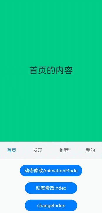
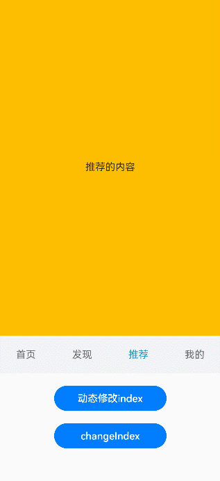
若希望不滑动内容页和点击页签也能实现内容页和页签的切换,可以将currentIndex传给Tabs的index参数,通过改变currentIndex来实现跳转至指定索引值对应的TabContent内容。也可以使用TabsController,TabsController是Tabs组件的控制器,用于控制Tabs组件进行内容页切换。通过TabsController的changeIndex方法来实现跳转至指定索引值对应的TabContent内容。
// ...
  @State currentIndex: number = 2;
  @State currentAnimationMode: AnimationMode = AnimationMode.CONTENT_FIRST;
  private controller: TabsController = new TabsController();

  // ...
              Tabs({ barPosition: BarPosition.End, index: this.currentIndex, controller: this.controller }) {
                // ...
              }
              .animationDuration(0)
              .height(300)
              .animationMode(this.currentAnimationMode)
              .onChange((index: number) => {
                this.currentIndex = index;
              })

              // app.string.ContentWillChange_animationMode资源文件中的value值为“动态修改animationMode”
              Button($r('app.string.ContentWillChange_animationMode')).width('50%').margin({ top: 20 })
                .onClick(()=>{
                  if (this.currentAnimationMode === AnimationMode.CONTENT_FIRST) {
                    this.currentAnimationMode = AnimationMode.ACTION_FIRST;
                  } else if (this.currentAnimationMode === AnimationMode.ACTION_FIRST) {
                    this.currentAnimationMode = AnimationMode.NO_ANIMATION;
                  } else if (this.currentAnimationMode === AnimationMode.NO_ANIMATION) {
                    this.currentAnimationMode = AnimationMode.CONTENT_FIRST_WITH_JUMP;
                  } else if (this.currentAnimationMode === AnimationMode.CONTENT_FIRST_WITH_JUMP) {
                    this.currentAnimationMode = AnimationMode.ACTION_FIRST_WITH_JUMP;
                  } else if (this.currentAnimationMode === AnimationMode.ACTION_FIRST_WITH_JUMP) {
                    this.currentAnimationMode = AnimationMode.CONTENT_FIRST;
                  }
                })

              // app.string.ContentWillChange_changeIndex资源文件中的value值为“动态修改index”
              Button($r('app.string.ContentWillChange_changeIndex')).width('50%').margin({ top: 20 })
                .onClick(() => {
                  this.currentIndex = (this.currentIndex + 1) % 4;
                })

              Button('changeIndex').width('50%').margin({ top: 20 })
                .onClick(() => {
                  let index = (this.currentIndex + 1) % 4;
                  this.controller.changeIndex(index);
                })
图12 切换指定页签
开发者可以通过Tabs组件的onContentWillChange接口,设置自定义拦截回调函数。拦截回调函数在下一个页面即将展示时被调用,如果回调返回true,新页面可以展示;如果回调返回false,新页面不会展示,仍显示原来页面。
Tabs({ barPosition: BarPosition.End, index: this.currentIndex, controller: this.controllerTwo }) {
  // ...
}
// ...
.onContentWillChange((currentIndex, comingIndex) => {
  if (comingIndex === 2) {
    return false;
  }
  return true;
})
图13 支持开发者自定义页面切换拦截事件
支持适老化
在适老化大字体场景下,底部页签提供大字体弹窗显示内容。当组件识别到大字体时,基于设置的文字和图标等内容,构建长按提示弹窗。当用户长按弹窗后,滑动到下一个页签位置时,使用新页签的弹窗提示内容替换上一个页签提示内容,抬手关闭弹窗并切换到对应TabContent内容页。
弹窗只适用于底部页签BottomTabBarStyle。
图14 在适老化场景下通过长按底部页签显示适老化弹窗。
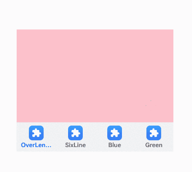
// 如需作为页面入口,请取消@Entry的注释并删除export关键字
// @Entry
@Component
export struct AgeFriendlyTabs {

  build() {
    NavDestination() {
      Column() {
        Tabs({ barPosition: BarPosition.End }) {
          TabContent() {
            Column().width('100%').height('100%').backgroundColor(Color.Pink)
          }.tabBar(new BottomTabBarStyle($r('sys.media.ohos_app_icon'), 'OverLength'))

          TabContent() {
            Column().width('100%').height('100%').backgroundColor(Color.Yellow)
          }.tabBar(new BottomTabBarStyle($r('sys.media.ohos_app_icon'), 'SixLine'))

          TabContent() {
            Column().width('100%').height('100%').backgroundColor(Color.Blue)
          }.tabBar(new BottomTabBarStyle($r('sys.media.ohos_app_icon'), 'Blue'))

          TabContent() {
            Column().width('100%').height('100%').backgroundColor(Color.Green)
          }.tabBar(new BottomTabBarStyle($r('sys.media.ohos_app_icon'), 'Green'))
        }
        .vertical(false)
        .scrollable(true)
        .barMode(BarMode.Fixed)
        .width('100%')
        .backgroundColor(0xF1F3F5)
      }.width('80%').height(200)
      .margin({ top: 200 })
    }
  }
}
控制页面缓存数
从API version 19开始,开发者可以通过cachedMaxCount接口,设置子组件的最大缓存个数和缓存模式。默认情况下Tabs创建时会一次性预加载所有TabContent,而且已加载的页面不会释放,可能会带来性能内存问题。此时可以设置cachedMaxCount属性控制缓存的页面数量,设置此属性后不会进行页面预加载,使用懒加载机制(仅切换到页面时才加载),当切换页面时根据所设置的TabsCacheMode决定保留缓存或者释放页面。
- TabsCacheMode枚举值为CACHE_BOTH_SIDE时,缓存当前显示的子组件和其两侧的子组件。
- TabsCacheMode枚举值为CACHE_LATEST_SWITCHED时,缓存当前显示的子组件和最近切换过的子组件。
- 存在翻页动画时,从页面1直接切换到页面3,翻页动画会包含页面2,页面2也会被加载,如果此时页面2不在缓存范围内,页面切换完成后会立马释放。
图15 在页面缓存场景下通过点击yellow按键切换界面。
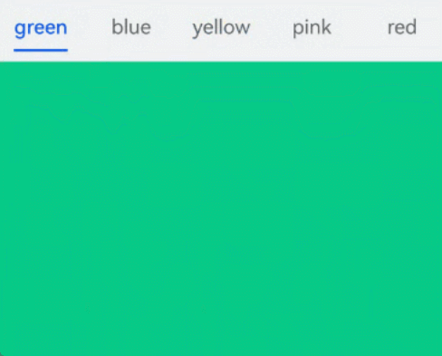
// 如需作为页面入口,请取消@Entry的注释并删除export关键字
// @Entry
@Component
export struct NumberOfCachesTabBar {
  build() {
    // ...
          Tabs({ barPosition: BarPosition.Start }) {
            TabContent() {
              MyComponent({ color: '#00CB87' })
            }.tabBar(SubTabBarStyle.of('green'))

            TabContent() {
              MyComponent({ color: '#007DFF' })
            }.tabBar(SubTabBarStyle.of('blue'))

            TabContent() {
              MyComponent({ color: '#FFBF00' })
            }.tabBar(SubTabBarStyle.of('yellow'))

            TabContent() {
              MyComponent({ color: '#E67C92' })
            }.tabBar(SubTabBarStyle.of('pink'))

            TabContent() {
              MyComponent({ color: '#FF0000' })
            }.tabBar(SubTabBarStyle.of('red'))
          }
          .width(360)
          .height(296)
          .backgroundColor('#F1F3F5')
          .cachedMaxCount(1, TabsCacheMode.CACHE_BOTH_SIDE)
          // ...
  }
}

@Component
struct MyComponent {
  private color: string = '';

  aboutToAppear(): void {
    console.info('aboutToAppear backgroundColor:' + this.color);
  }

  aboutToDisappear(): void {
    console.info('aboutToDisappear backgroundColor:' + this.color);
  }

  build() {
    Column()
      .width('100%')
      .height('100%')
      .backgroundColor(this.color)
  }
}
基于以上示例代码为例,不同场景下的缓存策略如下:
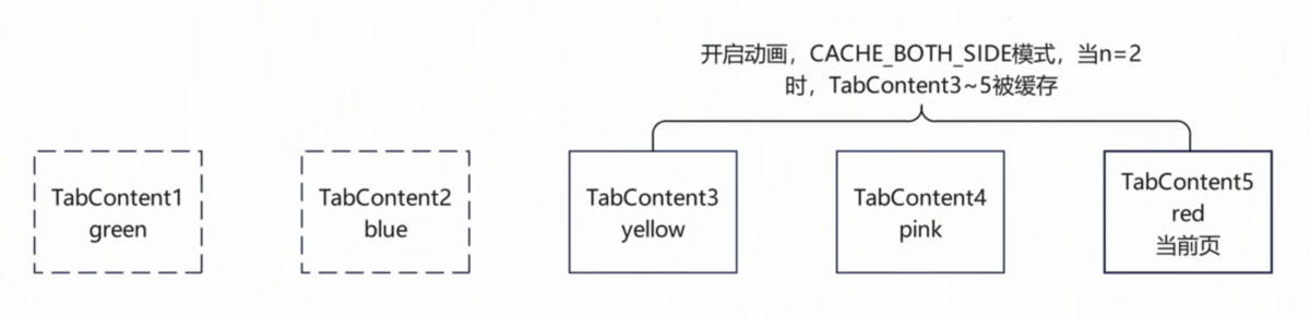
-
如图16所示,使用默认翻页动画,CACHE_BOTH_SIDE模式,n设置为2,点击TabBar切换到yellow页,TabContent1
3被缓存。再切换到red页,TabContent1、2释放,TabContent35被缓存。图16 默认翻页动画,CACHE_BOTH_SIDE模式示意图
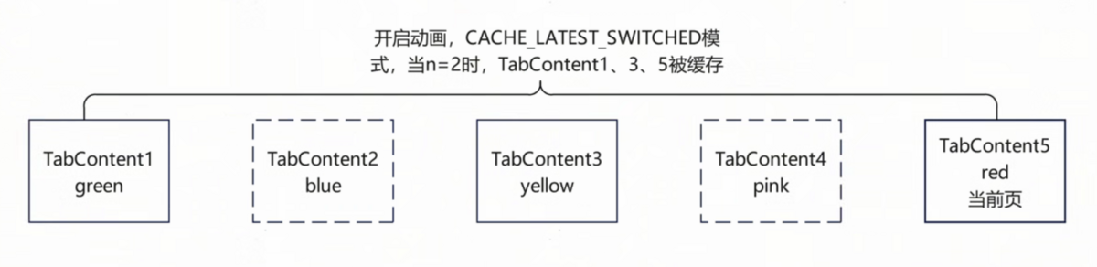
-
如图17所示,使用默认翻页动画,CACHE_LATEST_SWITCHED模式,n设置为2,点击TabBar切换到yellow页,TabContent1、3被缓存,TabContent2释放。再切换到red页,TabContent1、3、5被缓存,TabContent4释放。
图17 默认翻页动画,CACHE_LATEST_SWITCHED模式示意图
-
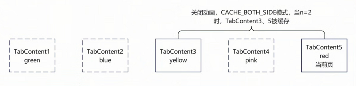
如图18所示,关闭翻页动画,CACHE_BOTH_SIDE模式,n设置为2,点击TabBar切换到yellow页,TabContent1、3被缓存。再切换到red页,TabContent3、5被缓存,TabContent1释放。
图18 关闭翻页动画,CACHE_BOTH_SIDE模式示意图
-
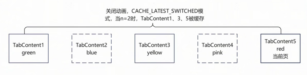
如图19所示,关闭翻页动画,CACHE_LATEST_SWITCHED模式,n设置为2,点击TabBar切换到yellow页,TabContent1、3被缓存。再切换到red页,TabContent1、3、5被缓存。
图19 关闭翻页动画,CACHE_LATEST_SWITCHED模式示意图