切换按钮 (Toggle)
Toggle组件提供状态按钮样式、勾选框样式和开关样式,一般用于两种状态之间的切换。具体用法请参考Toggle。
创建切换按钮
Toggle通过调用ToggleOptions来创建,具体调用形式如下:
Toggle(options: { type: ToggleType, isOn?: boolean })
其中,ToggleType为开关类型,包括Button、Checkbox和Switch,isOn为切换按钮的状态。
API version 11开始,Checkbox默认样式由圆角方形变为圆形。
接口调用有以下两种形式:
-
创建不包含子组件的Toggle。
当ToggleType为Checkbox或者Switch时,用于创建不包含子组件的Toggle:
Toggle({ type: ToggleType.Checkbox, isOn: false }).id('toggle1') // 请开发者替换为实际的idToggle({ type: ToggleType.Checkbox, isOn: true }).id('toggle2') // 请开发者替换为实际的id Toggle({ type: ToggleType.Switch, isOn: false }).id('toggle3') // 请开发者替换为实际的idToggle({ type: ToggleType.Switch, isOn: true }).id('toggle4') // 请开发者替换为实际的id
-
创建包含子组件的Toggle。
当ToggleType为Button时,只能包含一个子组件,如果子组件有文本设置,则相应的文本内容会显示在按钮上。
Toggle({ type: ToggleType.Button, isOn: false }) {Text('status button').fontColor('#182431').fontSize(12)}.width(100).id('toggle5') // 请开发者替换为实际的idToggle({ type: ToggleType.Button, isOn: true }) {Text('status button').fontColor('#182431').fontSize(12)}.width(100).id('toggle6') // 请开发者替换为实际的id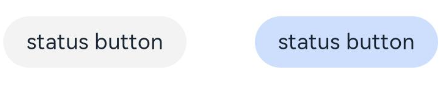
自定义样式
-
通过selectedColor属性设置Toggle打开选中后的背景颜色。
Toggle({ type: ToggleType.Button, isOn: true }) {Text('status button').fontColor('#182431').fontSize(12)}.width(100).selectedColor(Color.Pink)// ···Toggle({ type: ToggleType.Checkbox, isOn: true }).selectedColor(Color.Pink)// ···Toggle({ type: ToggleType.Switch, isOn: true }).selectedColor(Color.Pink)// ···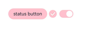
-
通过switchPointColor属性设置Switch类型的圆形滑块颜色,仅对type为ToggleType.Switch生效。
Toggle({ type: ToggleType.Switch, isOn: false }).switchPointColor(Color.Pink)// ···Toggle({ type: ToggleType.Switch, isOn: true }).switchPointColor(Color.Pink)// ···
添加事件
除支持通用事件外,Toggle还用于选中和取消选中后触发某些操作,可以绑定onChange事件来响应操作后的自定义行为。
Toggle({ type: ToggleType.Switch, isOn: false })
  .onChange((isOn: boolean) => {
    if(isOn) {
      // 需要执行的操作
      // ···
    }
  })
场景示例
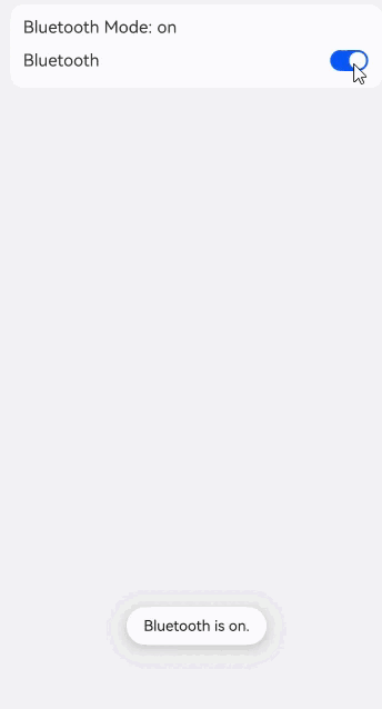
Toggle用于切换蓝牙开关状态。
// xxx.ets
import { promptAction } from '@kit.ArkUI';

@Entry
@Component
export struct ToggleSample {
  @State message: string = 'off';
  pathStack: NavPathStack = new NavPathStack();

  build() {
    NavDestination() {
      Column({ space: 8 }) {
        Column({ space: 8 }) {
          Text('Bluetooth Mode: ' + this.message)
            .id('message')
          Row() {
            Text('Bluetooth')
            Blank()
            Toggle({ type: ToggleType.Switch })
              .id('toggle') // 请开发者替换为实际的id
              .onChange((isOn: boolean) => {
                if (isOn) {
                  this.message = 'on';
                  promptAction.openToast({ 'message': 'Bluetooth is on.' });
                } else {
                  this.message = 'off';
                  promptAction.openToast({ 'message': 'Bluetooth is off.' });
                }
              })
          }.width('100%')
        }
        .alignItems(HorizontalAlign.Start)
        .backgroundColor('#fff')
        .borderRadius(12)
        .padding(12)
        .width('100%')
      }
      .width('100%')
      .height('100%')
      .padding({ left: 12, right: 12 })
    }
    .backgroundColor('#f1f2f3')
    // 请将$r('app.string.ToggleCaseExample_title')替换为实际资源文件,在本示例中该资源文件的value值为"toggle蓝牙示例"
    .title($r('app.string.ToggleCaseExample_title'))
  }
}