弧形按钮 (ArcButton)(圆形屏幕推荐使用)
从API version 18开始支持ArcButton。ArcButton是弧形按钮组件,推荐用于圆形屏幕。为用户提供强调、普通、警告等样式按钮。具体用法请参考ArcButton。
创建按钮
ArcButton通过调用以下接口来创建。
ArcButton({
  options: new ArcButtonOptions({
    label: 'OK',
    position: ArcButtonPosition.TOP_EDGE,
    styleMode: ArcButtonStyleMode.EMPHASIZED_LIGHT,
  // ···
  })
})
其中,label设置按钮文字,position设置按钮类型,styleMode设置按钮样式。
设置按钮类型
ArcButton有上弧形按钮和下弧形按钮两种类型。使用position设置按钮类型。
-
下弧形按钮(默认类型)。
通过将position属性设置为ArcButtonPosition.BOTTOM_EDGE,可以将按钮设置为下弧形按钮。
ArcButton({options: new ArcButtonOptions({label: 'OK',position: ArcButtonPosition.BOTTOM_EDGE,styleMode: ArcButtonStyleMode.EMPHASIZED_LIGHT,// ···})})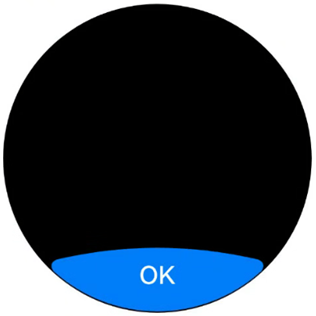
-
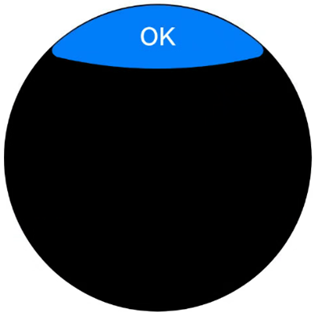
上弧形按钮。
通过将position属性设置为ArcButtonPosition.TOP_EDGE,可以将按钮设置为上弧形按钮。
ArcButton({options: new ArcButtonOptions({label: 'OK',position: ArcButtonPosition.TOP_EDGE,styleMode: ArcButtonStyleMode.EMPHASIZED_LIGHT,// ···})})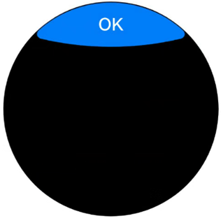
自定义样式
-
设置背景色。
使用backgroundColor属性设置按钮的背景色。
ArcButton({options: new ArcButtonOptions({label: 'OK',styleMode: ArcButtonStyleMode.CUSTOM,backgroundColor: ColorMetrics.resourceColor('#707070')})})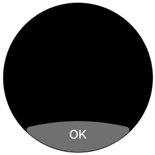
-
设置文本颜色。
使用fontColor属性设置按钮的文本颜色。
ArcButton({options: new ArcButtonOptions({label: 'OK',styleMode: ArcButtonStyleMode.CUSTOM,backgroundColor: ColorMetrics.resourceColor('#E84026'),fontColor: ColorMetrics.resourceColor('#707070')})})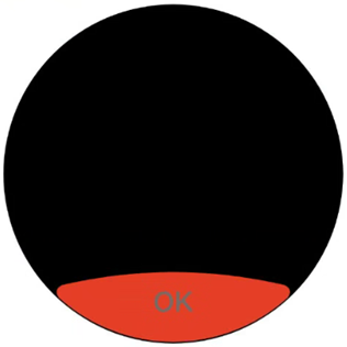
-
设置阴影颜色。
使用shadowEnabled属性启用按钮阴影,并通过shadowColor属性设置按钮的阴影颜色。
ArcButton({options: new ArcButtonOptions({label: 'OK',shadowEnabled: true,shadowColor: ColorMetrics.resourceColor('#ffec1022')})})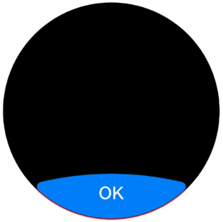
添加事件
-
绑定onClick事件来响应点击操作后的自定义行为。
ArcButton({options: new ArcButtonOptions({label: 'OK',// ···onClick: () => {hilog.info(DOMAIN, TAG, 'ArcButton onClick');},})}) -
绑定onTouch事件来响应触摸操作后的自定义行为。
ArcButton({options: new ArcButtonOptions({label: 'OK',// ···onTouch: (event: TouchEvent) => {hilog.info(DOMAIN, TAG, 'ArcButton onTouch');}})})
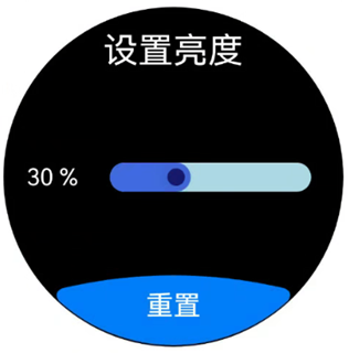
场景示例
在亮度设置界面,进度条显示当前亮度为30%。点击重置后,亮度值将被重置为默认的50%。
运行该示例推荐在Wearable设备上以获得最佳显示效果,同时支持在其他设备上运行。若要在Wearable设备上运行,在src/main目录下的工程配置文件module.json5中deviceTypes标签内配置wearable。
"module": {
  // ···
  "deviceTypes": [
    "wearable"
  ],
  // ···
}
import { LengthMetrics, LengthUnit, ArcButton, ArcButtonOptions, ArcButtonStyleMode } from '@kit.ArkUI';

const BRIGHT_NESS_VALUE = 30;
const BRIGHT_NESS_VALUE_DEFAULT = 50;

@Entry
@ComponentV2
struct BrightnessPage {
  @Local brightnessValue: number = BRIGHT_NESS_VALUE;
  private defaultBrightnessValue: number = BRIGHT_NESS_VALUE_DEFAULT;

  build() {
    RelativeContainer() {
      // 请将$r('app.string.Brightness')替换为实际资源文件,在本示例中该资源文件的value值为"设置亮度"
      Text($r('app.string.Brightness'))
        .fontColor(Color.White)
        .id('id_brightness_set_text')
        .fontSize(24)
        .margin({ top: 16 })
        .alignRules({
          middle: { anchor: '__container__', align: HorizontalAlign.Center }
        })

      Text(`${this.brightnessValue} %`)
        .fontColor(Color.White)
        .id('id_brightness_min_text')
        .margin({ left: 16 })
        .alignRules({
          start: { anchor: '__container__', align: HorizontalAlign.Start },
          center: { anchor: '__container__', align: VerticalAlign.Center }
        })

      Slider({
        value: this.brightnessValue,
        min: 0,
        max: 100,
        style: SliderStyle.InSet
      })
        .blockColor('#191970')
        .trackColor('#ADD8E6')
        .selectedColor('#4169E1')
        .width(150)
        .id('id_brightness_slider')
        .margin({ left: 16, right: 16 })
        .onChange((value: number, mode: SliderChangeMode) => {
          this.brightnessValue = value;
        })
        .alignRules({
          center: { anchor: 'id_brightness_min_text', align: VerticalAlign.Center },
          start: { anchor: 'id_brightness_min_text', align: HorizontalAlign.End }
        })

      ArcButton({
        options: new ArcButtonOptions({
          // 请将$r('app.string.Reset')替换为实际资源文件,在本示例中该资源文件的value值为"重置"
          label: $r('app.string.Reset'),
          styleMode: ArcButtonStyleMode.EMPHASIZED_LIGHT,
          fontSize: new LengthMetrics(19, LengthUnit.FP),
          onClick: () => {
            this.brightnessValue = this.defaultBrightnessValue;
          }
        })
      })
        .alignRules({
          middle: { anchor: '__container__', align: HorizontalAlign.Center },
          bottom: { anchor: '__container__', align: VerticalAlign.Bottom }
        })
    }
    .height('100%')
    .width('100%')
    .backgroundColor(Color.Black)
  }
}