绘制几何图形 (Shape)
绘制组件用于在页面绘制图形,Shape组件是绘制组件的父组件,包含所有绘制组件的通用属性。具体用法请参考Shape。
创建绘制组件
绘制组件可以由以下两种形式创建:
-
绘制组件使用Shape作为父组件,实现类似SVG的效果。接口调用为以下形式:
Shape(value?: PixelMap)该接口用于创建带有父组件的绘制组件,其中value用于设置绘制目标,可将图形绘制在指定的PixelMap对象中,若未设置,则在当前绘制目标中进行绘制。
Shape() {Rect().width(300).height(50)} -
绘制组件单独使用,用于在页面上绘制指定的图形。有7种绘制类型,分别为Circle(圆形)、Ellipse(椭圆形)、Line(直线)、Polyline(折线)、Polygon(多边形)、Path(路径)、Rect(矩形)。以Circle的接口调用为例:
Circle(value?: { width?: string | number, height?: string | number })该接口用于在页面绘制圆形,其中width用于设置圆形的宽度,height用于设置圆形的高度,圆形直径由宽高最小值确定。
Circle({ width: 150, height: 150 })
形状视口viewPort
viewPort(value: { x?: number | string, y?: number | string, width?: number | string, height?: number | string })
形状视口viewPort指定用户空间中的一个矩形,该矩形映射到为关联的SVG元素建立的视区边界。viewPort属性的值包含x、y、width和height四个可选参数,x和y表示视区的左上角坐标,width和height表示其尺寸。
以下三个示例说明如何使用viewPort:
-
通过形状视口对图形进行放大与缩小。
class Tmp {public x: number = 0;public y: number = 0;public width: number = 75;public height: number = 75;}class TmpOne {public x: number = 0;public y: number = 0;public width: number = 300;public height: number = 300;}@Entry@Componentstruct ViewPort1 {viep: Tmp = new Tmp();viep1: TmpOne = new TmpOne();build() {Column() {// 画一个宽高都为75的圆// 请将$r('app.string.OriginalSizeCircle')替换为实际资源文件,在本示例中该资源文件的value值为"原始尺寸Circle组件"Text($r('app.string.OriginalSizeCircle')).margin({ top: 20 })Circle({ width: 75, height: 75 }).fill('rgb(39, 135, 217)')Row({ space: 10 }) {Column() {// 创建一个宽高都为150的shape组件,背景色为黄色,一个宽高都为75的viewPort。// 用一个蓝色的矩形来填充viewPort,在viewPort中绘制一个直径为75的圆。// 绘制结束,viewPort会根据组件宽高放大两倍。// 请将$r('app.string.EnlargedCircle')替换为实际资源文件,在本示例中该资源文件的value值为"shape内放大的Circle组件"Text($r('app.string.EnlargedCircle'))Shape() {Rect().width('100%').height('100%').fill('rgb(39, 135, 217)')Circle({ width: 75, height: 75 }).fill('rgb(213, 213, 213)')}.viewPort(this.viep).width(150).height(150).backgroundColor('rgb(23, 169, 141)')}Column() {// 创建一个宽高都为150的shape组件,背景色为黄色,一个宽高都为300的viewPort。// 用一个绿色的矩形来填充viewPort,在viewPort中绘制一个直径为75的圆。// 绘制结束,viewPort会根据组件宽高缩小两倍。// 请将$r('app.string.ShrunkCircle')替换为实际资源文件,在本示例中该资源文件的value值为"Shape内缩小的Circle组件"Text($r('app.string.ShrunkCircle'))Shape() {Rect().width('100%').height('100%').fill('rgb(213, 213, 213)')Circle({ width: 75, height: 75 }).fill('rgb(39, 135, 217)')}.viewPort(this.viep1).width(150).height(150).backgroundColor('rgb(23, 169, 141)')}}}}}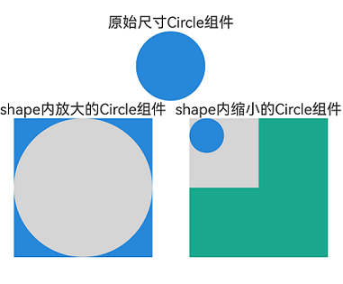
-
创建一个宽高都为300的shape组件,背景色为黄色,创建一个宽高都为300的viewPort。用一个蓝色的矩形来填充viewPort,在viewPort中绘制一个半径为75的圆。
class TmpTwo {public x: number = 0;public y: number = 0;public width: number = 300;public height: number = 300;}@Entry@Componentstruct ViewPort2 {viep: TmpTwo = new TmpTwo();build() {Column() {Shape() {Rect().width('100%').height('100%').fill('#0097D4')Circle({ width: 150, height: 150 }).fill('#E87361')}.viewPort(this.viep).width(300).height(300).backgroundColor('#F5DC62')}}}
-
创建一个宽高都为300的shape组件,背景色为黄色,创建一个宽高都为300的viewPort。用一个蓝色的矩形来填充viewPort,在viewPort中绘制一个半径为75的圆,将viewPort向右方和下方各平移150。
class TmpThree {public x: number = -150;public y: number = -150;public width: number = 300;public height: number = 300;}@Entry@Componentstruct ViewPort3 {viep: TmpThree = new TmpThree();build() {Column() {Shape() {Rect().width('100%').height('100%').fill('#0097D4')Circle({ width: 150, height: 150 }).fill('#E87361')}.viewPort(this.viep).width(300).height(300).backgroundColor('#F5DC62')}}}
自定义样式
示例通过commands来绘制路径,commands参数说明请参考SVG路径描述规范。
绘制组件支持通过各种属性更改组件样式。
-
通过fill可以设置组件填充区域颜色。
Path().width(100).height(100).commands('M150 0 L300 300 L0 300 Z').fill('#E87361').strokeWidth(0)
-
通过stroke可以设置组件边框颜色。
Path().width(100).height(100).fillOpacity(0).commands('M150 0 L300 300 L0 300 Z').stroke(Color.Red)
-
通过strokeOpacity可以设置边框透明度。
Path().width(100).height(100).fillOpacity(0).commands('M150 0 L300 300 L0 300 Z').stroke(Color.Red).strokeWidth(10).strokeOpacity(0.2)
-
通过strokeLineJoin可以设置线条拐角绘制样式。拐角绘制样式分为Bevel(使用斜角连接路径段)、Miter(使用尖角连接路径段)、Round(使用圆角连接路径段)。
Polyline().width(100).height(100).fillOpacity(0).stroke(Color.Red).strokeWidth(8).points([[20, 0], [0, 100], [100, 90]])// 设置折线拐角处为圆弧.strokeLineJoin(LineJoinStyle.Round)
-
通过strokeMiterLimit设置斜接长度与边框宽度比值的极限值。
斜接长度表示外边框外边交点到内边交点的距离,边框宽度即strokeWidth属性的值。
strokeMiterLimit取值需大于等于1,且在strokeLineJoin属性取值LineJoinStyle.Miter时生效。
Polyline().width(100).height(100).fillOpacity(0).stroke(Color.Red).strokeWidth(10).points([[20, 0], [20, 100], [100, 100]])// 设置折线拐角处为尖角.strokeLineJoin(LineJoinStyle.Miter)// 设置斜接长度与线宽的比值.strokeMiterLimit(1/Math.sin(45))Polyline().width(100).height(100).fillOpacity(0).stroke(Color.Red).strokeWidth(10).points([[20, 0], [20, 100], [100, 100]]).strokeLineJoin(LineJoinStyle.Miter).strokeMiterLimit(1.42)
-
通过antiAlias设置是否开启抗锯齿,默认值为true(开启抗锯齿)。
// 开启抗锯齿Circle().width(150).height(200).fillOpacity(0).strokeWidth(5).stroke(Color.Black)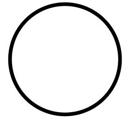 // 关闭抗锯齿Circle().width(150).height(200).fillOpacity(0).strokeWidth(5).stroke(Color.Black).antiAlias(false)
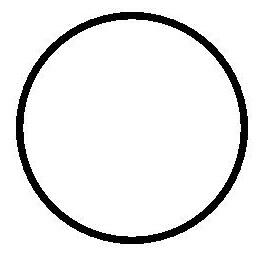
-
通过mesh设置网格效果,实现图像局部扭曲。
示例通过commands来绘制路径,commands参数说明请参考SVG路径描述规范。
import { FrameNode, NodeController, RenderNode } from '@kit.ArkUI';import { image } from '@kit.ImageKit';import { drawing } from '@kit.ArkGraphics2D';let offCanvas: OffscreenCanvas = new OffscreenCanvas(150, 150);let ctx = offCanvas.getContext('2d');class DrawingRenderNode extends RenderNode {private verts_: Array<number> = [0, 0, 50, 0, 410, 0, 0, 180, 50, 180, 410, 180, 0, 360, 50, 360, 410, 360];setVerts(verts: Array<number>): void {this.verts_ = verts}async draw(context: DrawContext) {const canvas = context.canvas;let pixelMap = ctx.getPixelMap(0, 0, 150, 150);const brush = new drawing.Brush(); // 只支持brush,使用pen没有绘制效果。canvas.attachBrush(brush);let verts: number[] = [0, 0, 410, 0, 50, 0, 0, 180, 50, 180, 410, 180, 0, 360, 410, 360, 50, 360];; // 18canvas.drawPixelMapMesh(pixelMap, 2, 2, verts, 0, null, 0);canvas.detachBrush();}}const renderNode = new DrawingRenderNode();renderNode.frame = {x: 0,y: 0,width: 150,height: 150};class MyNodeController extends NodeController {private rootNode: FrameNode | null = null;makeNode(uiContext: UIContext): FrameNode | null {this.rootNode = new FrameNode(uiContext);const rootRenderNode = this.rootNode.getRenderNode();if (rootRenderNode !== null) {rootRenderNode.appendChild(renderNode);}return this.rootNode;}}@Entry@Componentstruct Mesh {private myNodeController: MyNodeController = new MyNodeController();@State showShape: boolean = false;@State pixelMap: image.PixelMap | undefined = undefined;@State shapeWidth: number = 150;@State strokeWidth: number = 1;@State meshArray: Array<number> = [0, 0, 50, 0, 410, 0, 0, 180, 50, 180, 410, 180, 0, 360, 50, 360, 410, 360];aboutToAppear(): void {// 'resources/base/media/image.png'需要替换为开发者所需的图像资源文件let img: ImageBitmap = new ImageBitmap('resources/base/media/image.png');ctx.drawImage(img, 0, 0, 100, 100);this.pixelMap = ctx.getPixelMap(0, 0, 150, 150);}build() {Column() {Image(this.pixelMap).backgroundColor('#86C5E3').width(150).height(150).onClick(() => {// 'resources/base/media/image.png'需要替换为开发者所需的图像资源文件let img: ImageBitmap = new ImageBitmap('resources/base/media/image.png');ctx.drawImage(img, 0, 0, 100, 100);this.pixelMap = ctx.getPixelMap(1, 1, 150, 150);this.myNodeController.rebuild();this.strokeWidth += 1;})NodeContainer(this.myNodeController).width(150).height(150).backgroundColor(Color.Grey).onClick(() => {this.meshArray = [0, 0, 50, 0, 410, 0, 0, 180, 50, 180, 410, 180, 0, 360, 50, 360, 410, 360, 0];})Button('change mesh').margin(5).onClick(() => {this.meshArray = [0, 0, 410, 0, 50, 0, 0, 180, 50, 180, 410, 180, 0, 360, 410, 360, 50, 360];})Button('Show Shape').margin(5).onClick(() => {this.showShape = !this.showShape;})if (this.showShape) {Shape(this.pixelMap) {Path().width(150).height(60).commands('M0 0 L400 0 L400 150 Z')}.fillOpacity(0.2).backgroundColor(Color.Grey).width(this.shapeWidth).height(150).mesh(this.meshArray, 2, 2).fill(0x317AF7).stroke(0xEE8443).strokeWidth(this.strokeWidth).strokeLineJoin(LineJoinStyle.Miter).strokeMiterLimit(5)Shape(this.pixelMap) {Path().width(150).height(60).commands('M0 0 L400 0 L400 150 Z')}.fillOpacity(0.2).backgroundColor(Color.Grey).width(this.shapeWidth).height(150).fill(0x317AF7).stroke(0xEE8443).strokeWidth(this.strokeWidth).strokeLineJoin(LineJoinStyle.Miter).strokeMiterLimit(5).onDragStart(() => {})// mesh只对shape传入pixelMap时生效,此处不生效Shape() {Path().width(150).height(60).commands('M0 0 L400 0 L400 150 Z')}.fillOpacity(0.2).backgroundColor(Color.Grey).width(this.shapeWidth).height(150).mesh(this.meshArray, 2, 2).fill(0x317AF7).stroke(0xEE8443).strokeWidth(this.strokeWidth).strokeLineJoin(LineJoinStyle.Miter).strokeMiterLimit(5).onClick(() => {this.pixelMap = undefined;})}}}}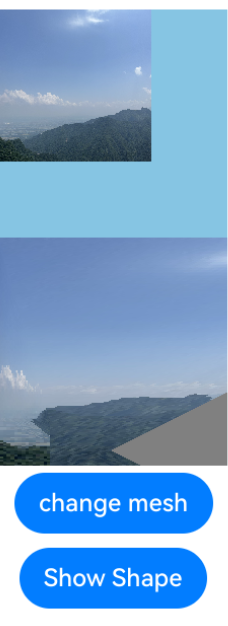
场景示例
绘制封闭路径
在Shape的(-80, -5)点绘制一个封闭路径,填充颜色0x317AF7,线条宽度3,边框颜色红色,拐角样式锐角(默认值)。
示例通过commands来绘制路径,commands参数说明请参考SVG路径描述规范。
@Entry
@Component
struct ShapeExample {
  build() {
    Column({ space: 10 }) {
      Shape() {
        Path().width(200).height(60).commands('M0 0 L400 0 L400 150 Z')
      }
      .viewPort({
        x: -80,
        y: -5,
        width: 500,
        height: 300
      })
      .fill('rgb(213, 213, 213)')
      .stroke('rgb(39, 135, 217)')
      .strokeWidth(3)
      .strokeLineJoin(LineJoinStyle.Miter)
      .strokeMiterLimit(5)
    }.width('100%').margin({ top: 15 })
  }
}

绘制圆和圆环
绘制一个直径为150的圆,和一个直径为150、线条为红色虚线的圆环(宽高设置不一致时以短边为直径)。
本示例通过strokeDashArray属性设置边框间隙来实现红色虚线的圆环,strokeDashArray属性参考strokeDashArray。
@Entry
@Component
struct CircleExample {
  build() {
    Column({ space: 10 }) {
      // 绘制一个直径为150的圆
      Circle({ width: 150, height: 150 })
      // 绘制一个直径为150、线条为红色虚线的圆环
      Circle()
        .width(150)
        .height(200)
        .fillOpacity(0)
        .strokeWidth(3)
        .stroke(Color.Red)
        .strokeDashArray([1, 2])
      // ...
    }.width('100%')
  }
}

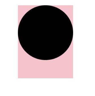
UI视觉属性作用效果
backgroundColor、linearGradient等通用属性作用于组件的背景区域,而不会在组件具体的内容区域生效。
@Entry
@Component
struct CircleExample {
  build() {
    Column({ space: 10 }) {
      // ...
      // 绘制一个直径为150的圆
      Circle()
        .width(150)
        .height(200)
        .backgroundColor(Color.Pink) // 会生效在一个150*200大小的矩形区域,而非仅在绘制的一个直径为150的圆形区域
    }.width('100%')
  }
}